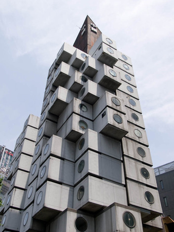
The recent shift in architectural styles to high-rise modular blocks arranged in non uniform variations is nothing new. Recent proposals like that of MVRDV's 'The Cloud' generated a number of complaints because of its abstract resemblance to that of the twin towers in mid explosion. The ironic thing about this style of architecture is that it originally stemmed from a post world war two movement called Metabolism. The ironic factor being that it was inspired by a war that flattened parts of Japan. The Metabolism Movement was created to set out a Utopian like goal for a downtrodden post-war Japan that would catapult it into the future. Designs for modern living, pushing the limits of cantilevered systems and seamlessly evolving side by side with the Post Modernist Movement that was sweeping the western world in the early 1950's. 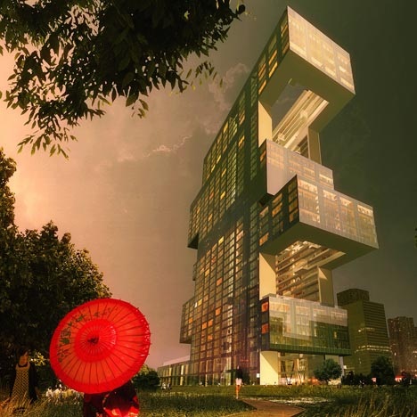
Project R6 by REX: A modern take on the original Metabolic Movement.
Project R6 by REX (Above) is a recent proposal for the International Business District in Seoul. If you compare it to the image at the beginning of the post (Nagakin by Kisho Kurokawa) you will see similarities and a progression inspired by regression. The staggered cantilevered sections creating platforms that defy gravity, the block style of the modern apartments and the uneasy and abnormal aesthetic of the building in general makes for very love or hate opinion. Modernism has influenced the new influx with the need for open space and an abundance of glass to allow for natural light. 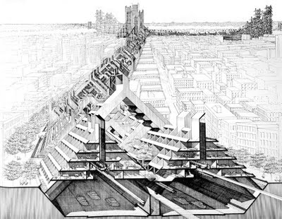
The movement was short lived, deemed too idealistic and impractical, but there was a very famous group of radical young architects who were inspired from the likes of Kurokawa... Archigram. The pop culture princes of our utopian futures. The designs of blocks moved into place by cranes, walking cities that could move and adapt to change are still a long way away of ever being feasible. However if you look at the work being produced by the likes of MAD and IwoMotoScott, then it's easy to see the influences of this movement. It is more subtly introduced into today's proposals, more feasible and believable, less egocentric and more systematic in creating buildings that change the living and working experience of the people that inhabit them. Practicality keeps us grounded but unreachable progression keeps us excited, keeps us longing for more. 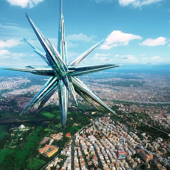
Superstar Project by MAD Architects.
4 Comments
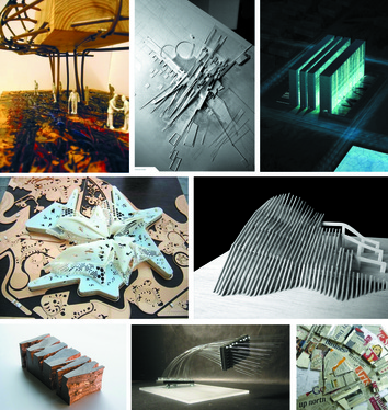 Having trouble getting your head around what a concept model is? Well you won't be alone. Concept design is a bafflement to the most seasoned of designer. When is a concept just a weird looking model, and when does it become useful? Basically concept models are rudimentary models that help create the overall theme, whether that be form, pattern ot colour that mainly influences your final design.
Any material that inspires your creativity can be used to represent a small part of your final design feature. Using a variety of either handmade, workshop or computerized models you can create and develop ideas into inspirational models. There is method behind the initial madness. 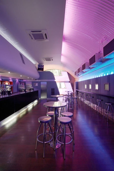
Bar Code (London) by Woods Bagot
 As the title suggests this post will be all about places to have a bite and a pint. Bar design is such an interesting area to look at as it generates feelings of relaxation, contemplation and nostalgia. We take in a lot more of the Interior detail within pubs and restaurants as we are sitting in one place for a long period of time. Lighting is key to generating interest and grabbing a punter in to come to your pub. More chic cocktail bars adopt the technique of LED colored lighting and glossy surfaces. This reflects light back into the space and makes the interior look very futuristic and inviting. However I prefer the more gastro colonial style pub. Wooden panels and a general industrial feel. A modern take on the old 'spit and sawdust' locals of yesteryear. I would say I fancy a tipple of real ale and like to feel comfortable within my drinking environment. In terms of food I'm all up for Tapas within a bar environment. A bit of calamaris, patatas bravas and chorizo is all I need for a nibble. However a blend of real ale and tapas is hard to come across in the UK pub scene (never mind the Spanish) so a gap in the market there then. Anyway. Have a look at this Pinterest board to see if there is any designs that get your taste buds tingling and your mouth salivating. (click on image below). 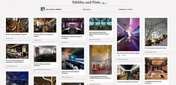
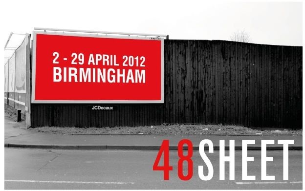
Image by 48_Sheet.
The more observant of you around Birmingham would have noticed recently an array of alternative media transforming the cities' billboards into an 'urban gallery'. 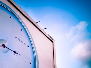
48 Sheet Photography Winner- by Helen Ogbourn.
48 Sheet is a project by the non-profit organisation, EC Arts. The idea is simple; one hundred 10ft x 20ft 48 sheet billboards have been stripped of their slogans and branding to be replaced by thought provoking urban art. 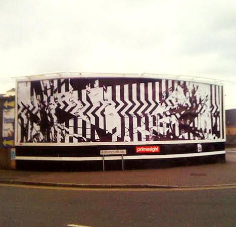
Untitled by UK artist Tom Tebby. Own Photo.
The brief posed the question to the participants about how, through graphic media, 'cultural curiosity' could be created in one of the UK's most culturally diverse cities. Glenn Howells, one of the members of the advisory board for the scheme, describes the visual impact of the city; " It questions our tolerance to increasing levels of advertising by swapping it for art." 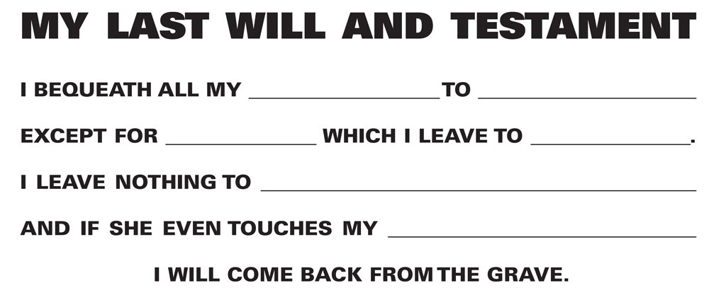
My Last Will and Testemant by American artist, Mary M Mazziotti
It is a relief to see art on the daily commute. It promotes more thought, conversation and curiosity than any run of the mill big branded company for yet another mobile phone. Having experienced a selection of these works on my own commute through Digbeth, I have seen people stop and take photos umpteen times. The wonderful thing about this is that people who you wouldn't necessarily pin point as being the 'arty' types have stopped and asked me 'what are you taking a photo of? What is it and why is it there?' It has brewed up conversation and debate and instantly brightened up the city. In the era of Banksy and street art, this type of venture needs to happen more. Less of the 2 for 1's and Price Crunch! More creativity and curiosity please! 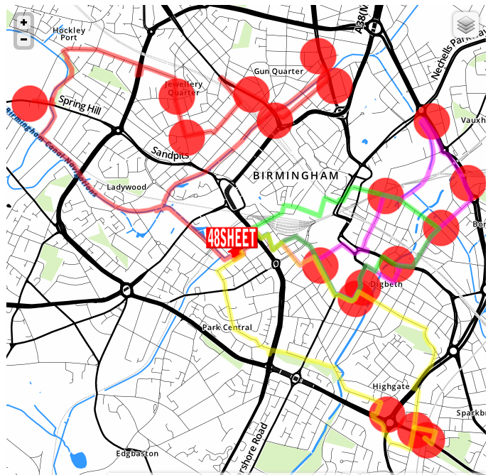
Click for a more detailed view of the billboard locations.
48 Sheet is running from the 2nd- 29th April 2012 and is funded by various Birmingham educational and art institutes. For more information please go to:
48sheet.com 
Today I have released a new website dedicated to detail drawing. My experiences as a visiting tutor have made me very aware of the lack of material available demonstrating detail drawings. You have to really search hard on the internet to come across decent drawings and that quest can be very time consuming. This led to me thinking of creating an online archive of detail examples from all walks of the web. This stops the endless searching and time wasting. The purpose of collating examples is for students and professionals alike to use them as inspiration for their own construction detail drawings. Detailing is something that doesn't come naturally, you have to be informed of building technology and construction methods to begin to grasp how to construct interior and exterior elements. Looking at examples can make you aware of certain materials or terminology needed to develop detail drawings. If you don't know what a certain material or constructional element is Google it and find out so you remember for next time. 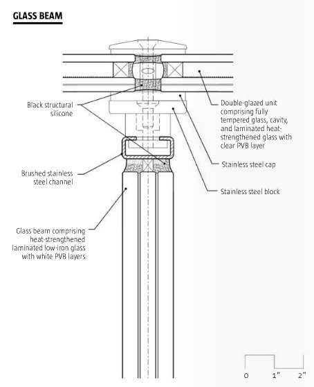
For example: Observe the drawing above and lets say you didn't know what a stainless steel cap was (don't put it onto your detail drawings if you don't know what it is, it's good to have the knowledge!) A simple Google result would reveal not only what it is but what it looks like. 
The current website is an early release with more elements expected to follow these include:
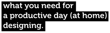 Working from home is an art, and a lot like art it can be done badly and on the other hand it can be done brilliantly. Naturally our flaw of being human is our very short attention span and concentration levels so low that this alone proves that we do evolve from our banana loving ancestors. On the very rare occasion that I am granted a days work from home, I suddenly feel the urge to make copious amounts of caffeinated hot drinks and watch re-runs of M*A*S*H. This is bad. Fighting that sudden urge is on par to fighting off the urge to scratch an irritating itch. However like an itch, if you do the pleasurable thing and scratch, the consequences will be a lot worse. All that said I do pride myself on time-management and making the most of any available time. Whether this is the endless task of uploading content onto my website ready for opening, putting together a lecture or developing competition design entries, I have to do this at home. The good thing about working from home is that you dictate the pace, you dictate the tea and coffee flow and you dictate the speed at which you work.  When I was a student these days were called 'self directed study'. At first this concept was hard to grasp, I was in charge, and the only thing i'd been in charge of before was Preston North End on Premier Manager 98. I thought that this was a good sign at first considering I purchased Roberto Di-Matteo on a free transfer and took them to a mighty win in the Champions League. However my first experience with self-directed study failed miserably. Inevitably during my 1st year I spent these supposed educational enriching days at the 4077th wishing that I too could be chilling in a medical tent drinking homemade booze that would lull me into a drunken coma. The occasional sketch here and there, procrastinating over what colour pen would be best suited for design development sketches, so on and so forth. There came a time, a time of reckoning, a time of maturity. This time came towards the back end of my 2nd year at uni. I was determined not to work in the living room. I worked on a desk. This may sound obvious but for me this was a big move. I used to do all of my work sprawled out on the floor, it was comforting but equally it was distracting. A desk is designed for order and work-ability, if it was a person it would be a German engineer obsessed with precision and the notion that a clean working environment means a clean mind. 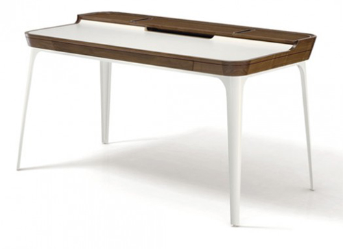 " If a desk were a person, it would be a German engineer. obsessed with precision and the notion that a clean working environment means a clean mind. " This wondrous ephihany made me think about some working from home ground rules. They are commandments to stick by to make sure you get the most out of all of your time at home.
 Click above for the PPDB Design from Home playlist Working from home should become natural because it is an opportunity to be not interrupted and to cram as much into a day as physically possible. The beauty of being a designer is this; the moment you realise that your projects are not work and that they are opportunities to grow, develop and become creative, then you will never see it as work. Treat it like a hobby, your passion and purpose in life. Design is easy if it is enjoyed.
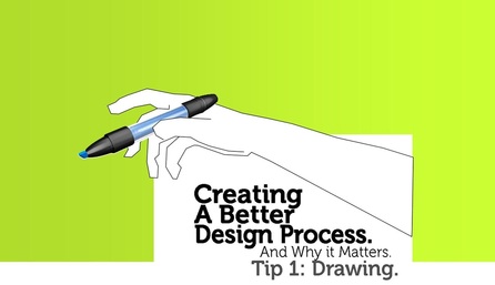
Drawing skills are increasingly being shunned by designers and being replaced by 3D modelling, which arguably is quicker, more flexible and more realistic in being able to represent an idea, conceptual or finalised. However I feel that we need to keep on using these skills as a means of communication. Drawing doesn't have to be a painstaking process, it can be the cliche 'cigarette packet' approach. No matter what quality, if it communicates the idea of the creator than the overall purpose of that drawing has been achieved. 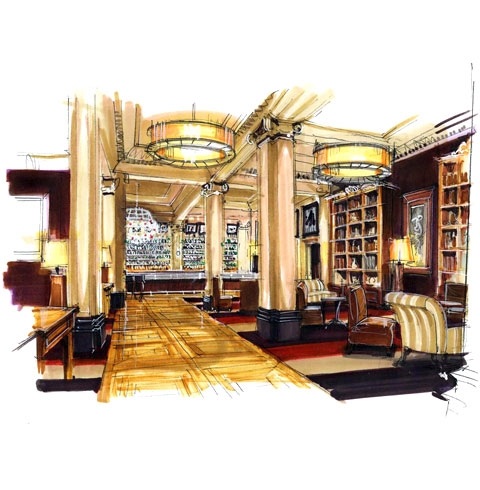
Holman Associates- Grand Hotel, Brighton. Hand rendered drawings like this still provoke admiration of the skill involved.
Be confident.Sketching is about visualising an idea from brain to paper. Arguably this is very hard and takes time and dedication to perfect (unless you are born with a natural ability). The process of being able to draw what we see with our eyes is arguably easier and results in a better, more confident drawing. This is one of the reasons why rough models are created from styrofoam or card, so you can accurately recreate a design in a physical form to use as a template for drawing. With a physical model you can rotate it, shine a light onto it to get an idea of the shadows being created and you can use it to further develop your design to make it more effective. 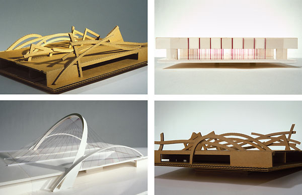
Creating sketch models can help you visualise design development sketches more easily. Image: www.garyhallman.com
Don't Be afraid of colour.With an infinite of colours available to use in the whole spectrum, the task of applying colour to a drawing can be rather daunting. The best approach to take is reminiscent of the previous chapter: 'Be Confident'. Know what colours you want to use and therefore know that you will need some complimentary tonal shades of these colours to create the effect of light, shadow and reflection. 1. With a choice of marker pen brand, start applying the shadows first in a tone of medium grey, re-apply the same marker to accentuate darker shadow areas. 2. Apply colour sparingly remembering that in areas where two corners meet and the fact that the further away an object is, it is depicted as being slighlty darker. 3. Quick and confident strokes. Don't be afraid of mistakes. A timid application of colour will mean a timid and naive result. Tracing As a practice technique.Tracing has a bad reputation. Tracing is deemed to be cheating. Well technically if you copy somebody else's work then yes it is basically plagiarism. However it can be used to promote muscle memory, this being a key element to what makes a good drawing. If you find certain shapes, like ellipses difficult to draw, then get a few printed examples of ellipses and place underneath some tracing paper. Keep tracing over the image for a few minutes. After 5 mins, take away the original image, and then start drawing the ellipse without the template. Keep on practicing this and you will begin to find that you start drawing more naturally. 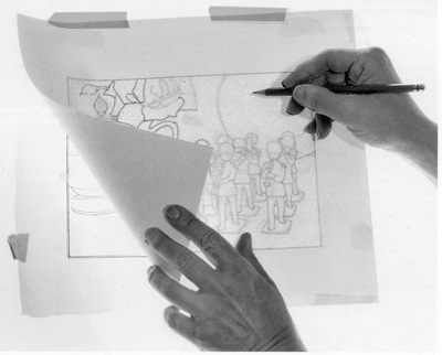
Tracing is a fantastic way of promoting muscle memory. Image: mightyartdemos.com
Equipment.A black pencil crayon for rough initial lines. 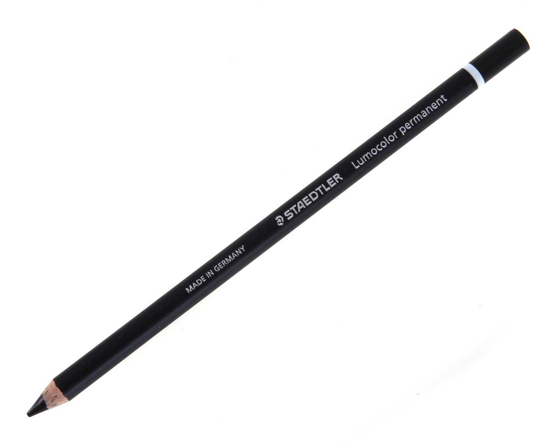
Oil based markers in a variety of shades. 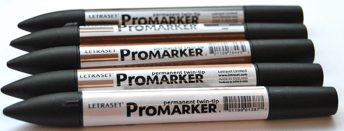
Other brands are available.
A selection of fine-liners in various weights. 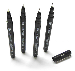
White chalk for highlights. 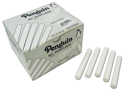
Overview.Drawing is not scary, you will be judged on clarity of an idea and how it is presented, not whether or not it looks pretty. If you create a pretty yet informative drawing then you have hit the jackpot. Practice, practice, practice.
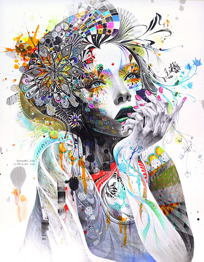
Circulation 2011/ A burst of colour and vibrant emotion.
I've recently come across these brilliant hand drawn pieces by a 21 year old South Korean artist, Minjae Lee a.k.a GrenoMJ. What is so compelling about these images is the sheer vibrancy of the colour and pattern used. The implementation of intricate floral patterns, gives the work a sense of delicacy and femininity. I originally thought these were digitally created using Adobe Illustrator and Photoshop, but I was very happy to hear that they were created by hand, using a mixture of oil based markers, fine-liners and other mixed media. The Video below shows the process of adding colour and line-work. The whole process takes roughly 80-100 hours with a lot of time being taken up by the intricate detailing of the floral patterns. There is a sense of confidence and ability that far surpasses his age of 21 years, indicating that this is somebody with natural ability. Canvasses can be purchased on the artist's official website for $700 (£446) and if you have a spare bit of cash after the festive celebrations, I would seriously consider an investment. I am sure that somebody with this amount of talent being so young, will see their work become highly sort after and make a tidy profit for purchasers now. The link to Minaje Lee's website is: http://www.grenomj.com/ 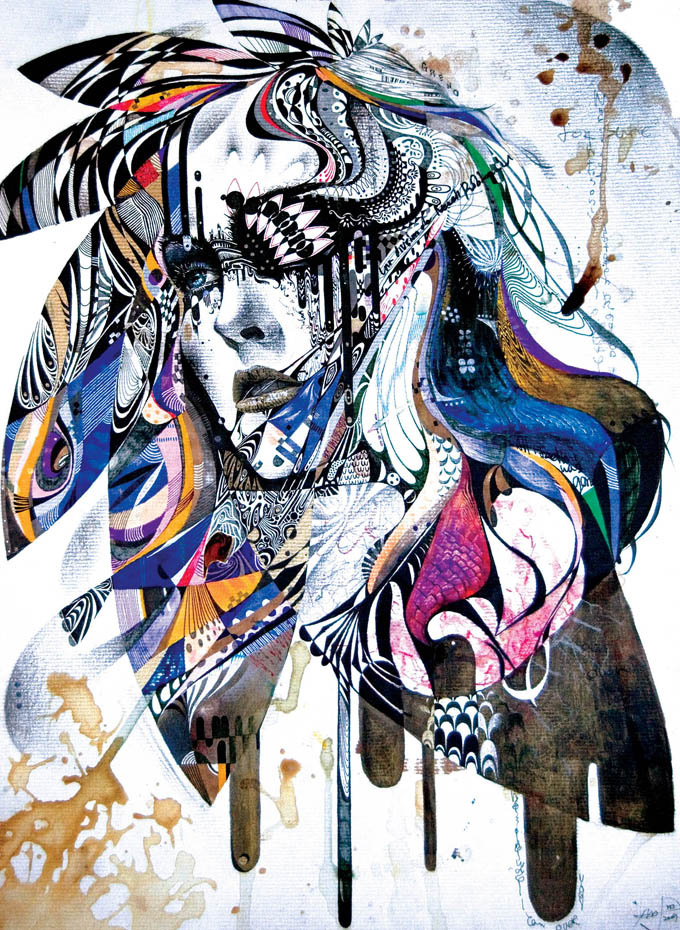
Reminiscence II
The overwhelming feeling these pieces evoke is one of angst and deep emotional tension that is building up and up to the point to where we see now. This boiling pot brimming over with bursts of tones, joyful patterns and irregularity. This crescendo of elements is then tainted with a sense of disorder and rebellion. The spilled coffee like marks and paint splatters shows a sense of imperfection to these so called 'perfect' feminine subjects. Simply a wonderful collection that keeps getting better and better.
The Architect from Inception was getting to grips with paradoxical Architecture.
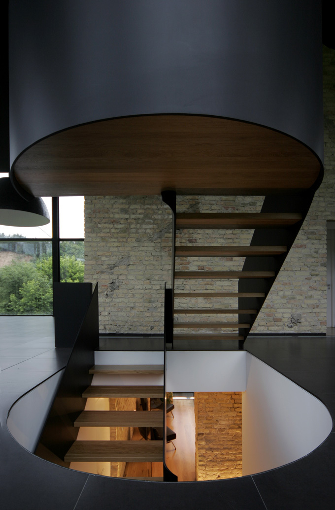
OVERVIEW.//This fantastic example of historical morphing with contemporary design, creates a visual language that is both inspiring and endearing. Situated in the Lithuanian capital of Vilnius, it blends into the lush green landscape, cut away into the sloping topography and making a visual statement that is both subtle and spectacular. The chosen aesthetic adds a sense of sophistication that is almost a poster piece for Le Corbusier's 'Machine for Living.' This modernistic approach is supplemented with a preservation for the historical. A cannon foundry lay on the original site which under further inspection happened to be built out of valuable Vilnius bricks. The priority for this build soon became a preservation and a symbiotic bond between the old and the new. The matte black finishes to the floor tiles and the solid balustrade adds to this sophistication. Oozing with sleek minimalism and pleasing modernism. The drop down dome pendants blend in with the interior scheme whilst adding subtle ambient lighting. The historical elements of the building are given respect and not hidden away, but are showcased and given a sense of purpose. Recessed floor strip panels are built into the tiling to softly light the undulating historical wall features. Overall this is a fantastic approach to what could have been a total disregard to the original features. The lesson to learn from this is that respect for the past can work well with a desire for the contemporary. 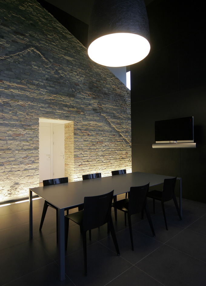
6 for dinner? Don't mind if I do
CREATE THE SAME STYLE.//Click on the image below to have a look at the Pinterest board to see how you can re-create this style. 
|

Designer. Did a blog. Starting blog again. Early Thirties. Like Food. Like Drink. Like Music. Like travelling. If you like this blog get involved, comment and send me a story or a product, lifestyle, or way of life to promote.
  |