|
Have you ever wanted a one stop place where you can view iconic Design classics without having to individually trawl through each manufacturers websites? Well fear not, thanks to John Lewis you can now scroll through an interactive info graphic which covers iconic pieces of timeless Design over the past 70 years. Information regarding the pieces/Designers is available by clicking on the image and if you really like what you see and fancy purchasing a piece of Design History, then you can always purchase through John Lewis by clicking on the link above. Have a scroll below and enjoy! SCROLL ME, CLICK ME, READ ME...
0 Comments
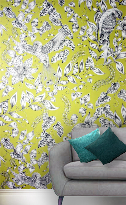 Wallpaper has had a turbulent history and as quick as it re-emerges itself back into fashion it is then abruptly banished into Room 101. However there is a real desire for intricate wallpapers that are bespoke and add that extra bit of elegance that your average hardware store can't supply. The montage I have created above shows the Kayyam range by Emma Shipley for Osborne & Little. This range is an exotic blend of rare birds and flowers. These floral details, in a monochrome effect, provide the perfect contrast for the bright chromatic background. (see below) The wallpapers are made from pure cotton and will add a splash of colour and a bold statement to any feature wall. You can purchase matching upholstery for cushions and each of these colour ways will blend in well with a contemporary or classic sofa with a grey hessian finish. The one shown in the montage above is the Walton range from Next Homeware.
2013 will see statement wallpapers like this very much being the in trend thing. Be creative with your choices and ultimately don't be afraid of colour! For more info: http://www.osborneandlittle.com/ http://www.emmajshipley.com 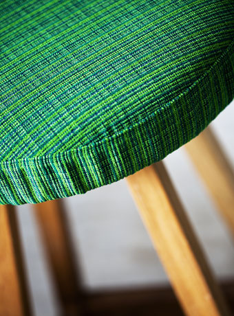
Juno 5936 Designed by Eva Larsson
Svensson Markspelle are a well established textile company based in Sweden (the name gives it away really) and have been around since 1887. Scandinavian Design is known for its elegance, simplicity and attention to detail. Out of their various ranges, Juno (pictured above and below) is one of my favorites because of the complimentary tonal variations. In both Commercial and Domestic Interiors choosing a dominant colour for your walls is sometimes a bold move and too much colour can drown out a space. To get that fresh Scandinavian look keep the walls neutral and bring colours into the space through the upholstery. The 5936 variation pictured above goes great with warm timber finishes. 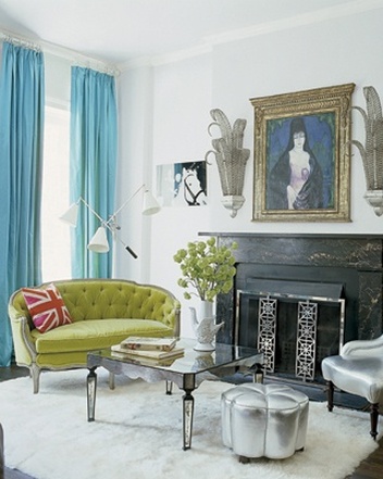
Keep the walls white and let the upholstery do the talking- As demonstrated in Nanette Lepore's Victorian Townhouse.
Their fabrics are suitable for Commercial use with a rub count of 50,000. The fabric is also a pretty mean fire-fighter. Made from Trevira CS, a clever material that has manipulated polyester fibres along with other sciency genius, which provides long term protection against fires.
For more information please visit: http://www.svenssonmarkspelle.com 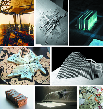 Having trouble getting your head around what a concept model is? Well you won't be alone. Concept design is a bafflement to the most seasoned of designer. When is a concept just a weird looking model, and when does it become useful? Basically concept models are rudimentary models that help create the overall theme, whether that be form, pattern ot colour that mainly influences your final design.
Any material that inspires your creativity can be used to represent a small part of your final design feature. Using a variety of either handmade, workshop or computerized models you can create and develop ideas into inspirational models. There is method behind the initial madness. 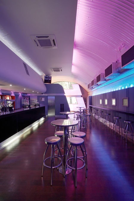
Bar Code (London) by Woods Bagot
 As the title suggests this post will be all about places to have a bite and a pint. Bar design is such an interesting area to look at as it generates feelings of relaxation, contemplation and nostalgia. We take in a lot more of the Interior detail within pubs and restaurants as we are sitting in one place for a long period of time. Lighting is key to generating interest and grabbing a punter in to come to your pub. More chic cocktail bars adopt the technique of LED colored lighting and glossy surfaces. This reflects light back into the space and makes the interior look very futuristic and inviting. However I prefer the more gastro colonial style pub. Wooden panels and a general industrial feel. A modern take on the old 'spit and sawdust' locals of yesteryear. I would say I fancy a tipple of real ale and like to feel comfortable within my drinking environment. In terms of food I'm all up for Tapas within a bar environment. A bit of calamaris, patatas bravas and chorizo is all I need for a nibble. However a blend of real ale and tapas is hard to come across in the UK pub scene (never mind the Spanish) so a gap in the market there then. Anyway. Have a look at this Pinterest board to see if there is any designs that get your taste buds tingling and your mouth salivating. (click on image below). 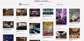
 View of site location with Rotunda left. Ok so I am at that point in the project where all my research montages are done and I am ready to start the concept stages of the design process. What I always do first is to do a 3D mock up of the site location to get a good idea of the area I will be designing in and the area surrounding it. This is relatively simple and adds a great professional look to your work. This is how it's done. 1. Go to Google Maps and find your site location in the viewer. www.googlemaps.com. My site location is the Black store which is just across from the Pavilions in Birmingham UK. You will have to Print Screen and crop the image externally as there is not an option to save direct from the website. 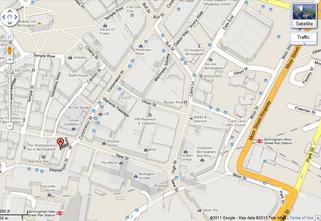 Google Map View. 2. Open this up in Sketchup Pro. Go to: File>Import find the directory where your file is saved in and change in the drop-down menu frrom .skp to .jpeg and your file should become visible. Click Insert. 3. Once Image is inserted you need to change the view to plan view and the camera to parallel projection and not perspective which is on default. To change this go to Camera on the toolbar and de-select Perspective view to Parallel Projection. 4. Once this is done you are ready to trace over the image using the line tool. Once all is done go back to perspective view and start extruding the solid shapes accordingly. 5. Your model should look something like this: 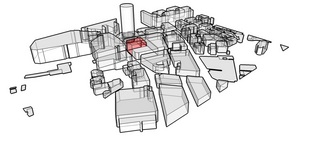 6. It is now time to get a more professional look than the standard Sketchup view-port has to offer. To do this we need a rendering program. The best by far is Vray for Sketchup and a 30 day free trial can be downloaded at www.asgvis.com. 7. Once the Vray plugin is installed you can begin assigning realistic materials. Click on the Vray material editor and start playing around with the pre-programmed materials. 8. Use a higher render setting to achieve the best results. I have given the building I am using a soft red emissive glow to indicate its importance. 9. The renders below show the 3 phases to my site development. 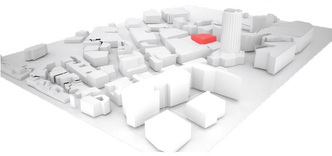 Phase 1. 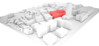 Phase 2. 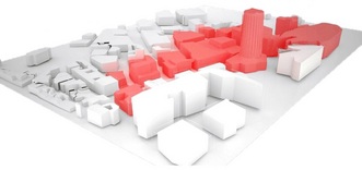 Phase 3. 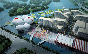 Aerial view of the proposed site. designboom.com Dutch architects MVRDV have won the International competition for designing China's comic and animation museum. MVRDV have a very unique style of architecture that merges philanthropy with a desire for a better future. In the world of animation and comics there are no limits. The ever increasing popularity of cartoons shows peoples desires for momentary lapses from reality. For a small moment in time you can conjure up dreams of talking pandas and fighting animals with magical powers. To understand the importance of animation and comics in China, and primarily in the Eastern world, you have to really understand why it is people become so engaged and engrossed in them. Japan created Anime and Manga which are hugely popular worldwide (just look at the global success and profits made from Pokemon) and therefore China ,being relatively close neighbours, have taken these characters to heart. They are embedded into everyday culture and prove to be not only popular for children but have a huge adult following also. 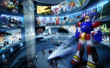 Interior view of the interactive exhibition space MVRDV have capitalised on this request for a sanctuary for the young and the comic geeks to have an experience that far beats anything that could come from a DVD or weekly comic. The image above shows the interactive exhibition space which makes up one of the 6 interior zones. This space incorporates state of the art technology to create an immersive experience. The pathfinding is made easy by elevated platforms that take you from one room to the next and widen at points of interest (like the 3D projection of Optimus Prime above) to allow for larger groups of visitors to stop and enjoy the attraction. 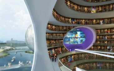 Comic book library that leads into the interactive zone. The importance of comics is the key to the ethos of this project. Many have a disregard for comics and see them as a means of entertainment rather than literature that should have any relevance. However in a market that sees 75 million of these comics sold in America alone (www.comichron.com) they cannot merely be deemed as unimportant literature. The comic book library embraces these artworks as if they were on par with a Charles Dickens classic and in my opinion rightly so. 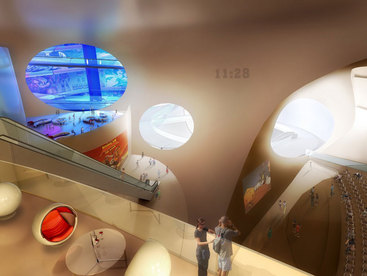 Interior view of the entrance area looking into the different zones. The museum creates a database of comics and animations that will educate and excite the generations to come. The futuristic exterior, that looks like Godzilla has left some of his eggs in the middle of an urban regeneration scheme, matched with an equally futuristic interior proves to be currently very popular. However I question the longevity of such a design and whether or not politicians are genuinely interested in statement architecture or are just looking for another 'Bilbao effect'. Time will tell. Change is feared, change is risky, change can sink the boat that floats. The question is why change a formula that works? Well it is all down to opinion and what one's opinion is of the current state and how this fits in with their own beliefs.
When one's beliefs are threatened then this provokes a defensive reaction. If a person is true to their beliefs in whatever shape or form then they will stay true to those beliefs until the end (whatever the end is). Design is a wondrous subject filled with many cynics and many contradictions. Feeding and succumbing to this supply and demand attitude the western world has created rather than believe and achieve. In today's society we consume products rather than create products. Consuming is made easy by large corporations who have an infinite back catalogue of wealth and as the Average Joe inspires to be a person of wealth, we consume this product in a benign desperation that this product will bring us that fame and fortune we desire. Design is partially to blame for this. In a lifestyle where aesthetics are dominant in both the product and in human qualities, we supply beautiful products for the beautiful people. These beautiful people with their beautiful products are normally skin deep shallow and desperate human beings who do not live life but trample on those who do and consume the consumers to achieve the life they so long for. Our demand for certain styles at cheap prices both cripples the integrity of the design industry and the designer. Designers are primarily people pleasers and pleasing is easy to do as we know what works, what people will buy and then repeat the process... Ikea for example do this and we as consumerists love Ikea. Ikea is to the design world what Boots is to the pharmaceutical industry, It is a cliché almost cop-out industry that relies on supply and demand, and we consume it (as do I). The point that I am trying to make is that consumerism is everywhere and no matter how hard you fight it or don't believe in it, you cannot avoid it. It creeps in unknowingly like a cancerous cell eating away at the core of what makes us human beings... I included ashamingly. 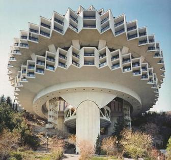 The Druzhba sanatorium in Yalta, Ukraine. Communism and architecture are more widely known for social equality and state ownership, however Frederic Chaubin has recently wrote a book called CCCP: Cosmic Communist Constructions Photographed. It opens the eyes to the world that communism is/was not just about creating a singular class and common ownership of the state, but had more lateral 'utopian' visions. Normally commutecture is associated with square blocks and excessive useof dark concrete promoting a strong, physical, and industrial aesthetic. However this book reveals the exploration of the possibilities of the now frowned upon material. Concrete is very much the Marmite of design, it is un-ethical to use it but has been around for generations and for some people these brutalist structures hold a special place in their hearts. These structures to me represent a bygone era of political uprising and technological advancements. Technology was increasing at such a rate that scientists predicted we would be driving flying cars by the year 2000 and would have a population of humans living on the moon. This era represents so much more than political ideals, it represents a time when anything was possible. It's like that stage when you look back at your past and wish you were a child again, when you had no concept of life, no concept of money, and you played endlessly until your eyes slowly closed and you drifted into a magical kingdom. At this period of time anything was achievable and this ultimately drove people to progression. The space race was an example of this, it was fundamentally a competition to who was the most powerful country in the world. 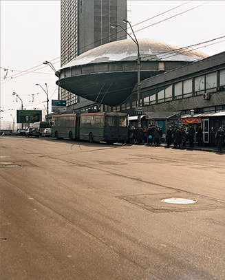 The Ukrainian Institute of Scientific and Technological Research and Development Communist architecture outlined in this publication shows that communist designers were able to make political structures that were modern and innovative. However, the forms are indeed in some cases organic and modern, but they still show signs of industry being the key driver of the overall finish. Rusting, hard and cold metals and filthy concrete symbolise the lack of expense involved in the finishing stages, no luxury items here. Communist architecture will never be as eye pleasing as he likes of Zaha Hadid's glossy neutral ambiguous designs, however they represent an age of ambition. An age where being nieve was king, smoking could not kill you and whoever had the most nuclear bombs was leading the world.... bigger was better. I feel somewhat we have lost this ambition and drive because we have no definition of who and what we stand for. Communists however right or wrong their beliefs were/are, they are fighting for a set of beliefs and this only strengthens and communicates the message that this group wants to get across. These morals should be used as a template of defining who we are as designers and who we are as human beings. We abide by a set of ethical laws that are recognised by the state so it is our moral duty as designers to create our own design beliefs, our own commandments and sculpt our own futures. Interior Design student Natalie Fordham, has created an online blog cataloguing her progress on the Design Ethics module of her course. The blog explores the use of materials, notably the cardboard tubes of Shigeru Ban and the vaulted plywood segments of IwoMotoScott's 'Voussior Cloud' (pictured). What this blog creates is a foundation for her to systematically explore and share ideas and inspiration that range from human to organic form. This format of blog writing in a way of showing the creative process of a design project, should be done more often by students. It is a great way to self-promote and shows a great understanding for design and the project. Check out her blog now at http://nataliefordham.blogspot.com/ 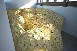 IwoMotoScott's 'Voussior Cloud'  |

Designer. Did a blog. Starting blog again. Early Thirties. Like Food. Like Drink. Like Music. Like travelling. If you like this blog get involved, comment and send me a story or a product, lifestyle, or way of life to promote.
  |
