Buzzfeed.com- Deck the halls with Stormtroopers?
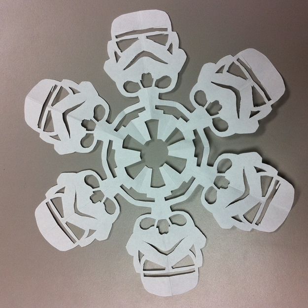
On my travels this morning I came across this brilliant post from Buzzfeed.com. When it comes to a D.I.Y Christmas why don't you try a Star Wars Christmas? A bit of cutting and snipping here and there and you could get yourself an alternative Christmas. The pdf below will help you create the above decoration, just print and cut out the grey areas. Even if the force is not strong with you then it is possible to create your own Star Wars Christmas. If the force is strong with you then you should have been informed of these festive crafts at Jedi school. Enjoy the holidays, because even Jedi celebrate Christmas. May the festive force be with you. For more designs visit: http://mattersofgrey.com/diy-star-wars-snowflakes/
0 Comments
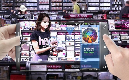 Hands off my CD missus! An app so good even your left thumb gets lost in it. So what is going on with HMV recently? Are they a music store or are they a library? The rows upon rows of CD's and DVD's suggest the latter. There was a situation recently where I wanted to find a CD and I chose HMV (not that there is much choice as this is the only surviving store left on the high-street) and was presented with an endless abyss of products. Some call it clutter, I call it an inconvenience. As a man, patience is not my most endearing quality, throw shopping into that mix and that recipe is not good. I want to be in and out in breakneck speed, acquiring my goods with precision and accuracy, no queue at the checkout and swiftly out of the store without being tempted by all of the 6 for 10 offers as I make my quick escape. HMV angers me. It angers me that they have no identity any more. A once well established British industry that has succumbed to throwing everything at the wall and hoping it sticks. The Dog and the gramophone is outdated but equally as iconic. The question is this... are HMV scared to move away from their heritage and create a new brand for themselves? Should the dog be a designer dog and the gramophone be replaced with an I-Pod? They need to do something to help themselves progress rather than stay stagnate. I have the answer to all of their problems. My inability to faff and ponder over a purchase requires me to be brutal and efficient. We can do anything with smart phones these days so why can't we use them to our (my) advantage? Augmented reality apps are not new. They are used within Google maps and tell you in live-time how far away you are from a destination. Why can't we produce an app that does this for sifting through all of the junk in HMV? HOW IT WORKS//1. With a 3G or Wi-fi connection impatient male #1 clicks on his HMV App. . 2. Using a product search for that specific store, the user finds the object they want to find. 3. If the product is out of stock then the user is told this straight away and saves 30mins of his precious life to do something new, like take up a new hobby and find the meaning of life (incidentally it's 42). 4. If it is available then the app kicks in with a tilt of the device 90degrees by the user. 5. The interface appears in live-time, through the video camera, and shows where and how far away the product of desire is. 6. You find the product, take it to a bearded cashier, and there you go. In a matter of 0.44 seconds in and out. No hassle, reduced blood pressure, and in an overall better mood. Image credits: Montage: Paper Plane Design Blog HMV store view: www.telegraph.co.uk Smartphone and hand image: matthewbuckland.com Any thoughts on this + HMV?// I am pretty obsessed with Helvetica. It symbolises suave and sophisticated nuances that any smooth and suave designer like myself wants to be part of. It is like being part of a classic car club, you know it's old and knackered, but you feel obliged to use it. You feel guilty if you drive the more practical newer version. The Prius is to cars what Arial is to fonts...boring. Helvetica is an old friend who will never let you down and never be afraid to tell you the truth. Ok so my relationship with Helvetica is not that intense, as I seem to be talking about it like man's best friend, but boy it doesn't half look good. If it was a woman it would be Holly Willoughby, tall and curvy in all of the right places. If it was a beverage it would be a Gordon's Gin and Tonic with a perfectly cut piece of lime added just after the ice hits the tall glass. Subsequently I have run out of similes. 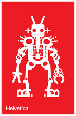 Helbotica, just one of the many creative uses of the Helvetica font. It is used by many designers and many publications because of its equal proportions and variety of finishes. Helvetica Neue, Textbook, Compressed, Light, Bold, Rounded... you name it and there's a variation of it. Fonts can be the make or break of any business or project. Times New Roman is far too Serif for anyone's liking and please if I see Comic Sans anywhere no matter what I will not trust that person with anything never mind buy something from them. The choice of font is very much like the choice of which Holy Grail will give eternal life in Indiana Jones and the Last Crusade. Get it wrong and you will end up like Walter Donovan (Julian Glover) and nobody wants to end like that, but get it right and yes you will be surrounded by shining lights, Denholm Elliott and co riding off into the sunset and you will live to see a massive cgi spaceship rise from the depths of the Nevada desert. So it's a good thing to get yourself the right font.  Don't do it! It's a Comic Sans. All rights Paramount Pictures. So forget Verdana, Century Gothic and definitely get rid of Times New Roman because Helvetica is here to stay. It will be used by myself almost religiously to the point where I will not even consider something else. It would have been great to write this blog piece in Helvetica so it wouldn't be a massive contradiction, sort it out Weebly. I want to share the Lovetica and as a special leading up to Christmas gift I will present you with a download of the font below. For all you noobs to new fonts and need help to install it, do the following... 1. Download it 2. Save it to a file 3. Go to control panel 4. Find fonts folder (in Personaliseand Appearance bit) 5. Open fonts folder 6. Right click and press 'Install new font' 7. DOWNLOAD THE FONT//
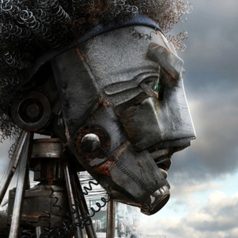 Bartlett School of Architecture graduate, Kibwe Tavares, has recently been gifted the prestigious RIBA Silver Medal Award. The requirements for winners of the award should be those who 'Promote excellence in the study of Architecture and to encourage Architectural debate worldwide'. Tavares's entry undoubtly does this on a variety of levels. His Architectural Animation piece buffers on the bridge between architectural imagery, intense storyline, contextual musicianary and social equality and brought together through the medium of animation. The Brixton riots or 'Bloody Saturday' was a tense boiling pot of social inequality and oppression between The Metropolitan Police and the local African-Carribean community who felt, during a recession, that levels of deprevation and quality of life in the area was poor and generally unexceptable. Hundreds were injured and equally as many arrested, but this now seems so relevant, the similarities between the economy now and back in 1981 are almost equal and arguably worse. However I feel that Kibwe Tavares is trying to get across the differences between the recession now and then and the riots associated with both eras. In 1981 the riots consisted of mainly young black men who felt helpless and unhelped from the government in power. It was about rich white men oppressing the young poor black men. The significant difference between then and now is that this recession is hitting people regardless of race or class and is on a global scale that nobody has really seen before. The importance of the African Carribean community being depicted as 'robots' is because robots are programmed to obey and take orders. They have no human organs or qualities and therefore deemed to have no emotion or feelings of inequality. This semi-otically represents how society saw this community, as inferior and not worthy, and this animation takes us on that journey. 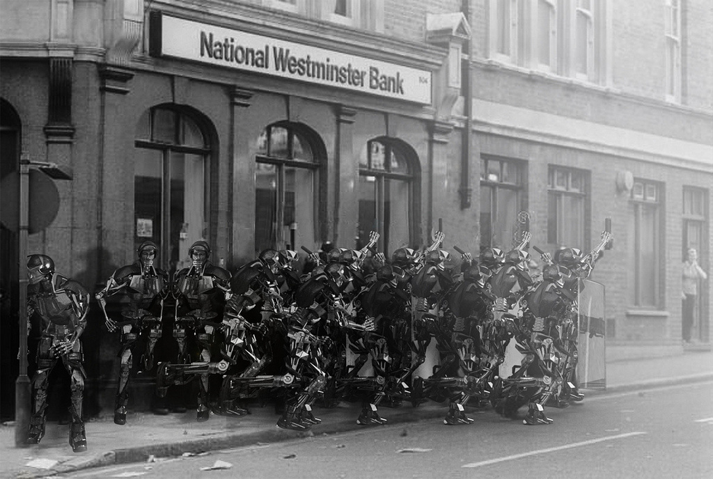 Old meets new: A distinctive photograph by David Hoffman overlaid digitally with the riot police robots. The animation, produced by Tavares's animation company Factory Fifteen, follows the story of a fresh faced robot going about his daily life through the bustling market place of Brixton, co-existing with 'humans'. The robot then finds himself in a factory that has the feeling of a workhouse to it, where fellow robots all meet and partake in recreational drugs to take them away from the mundane reality of Brixton to a more wonderous place. 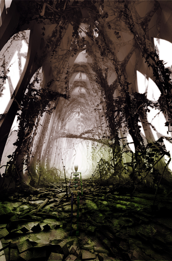 A hallucinatory formed Cathedral space set in Utopia. From drug induced architectural creations the protagonist is slowly transported back into the heat of a fierce street battle. Police clad robots in heavy riot gear pacing through the streets in an aggresive way, diving in on rebellious robots who dare to wreak havoc on the streets of London. A slow motioned battle commences that ends in our robot friend spread out on the floor, bruised and battered. Eyes twitching and then closing. Fading out to a black screen, we are left to pondor this 'person's' fate. An appropiate quote by Karl Marx is gently faded in; "History repeats itself, first as tragedy, second as farce". 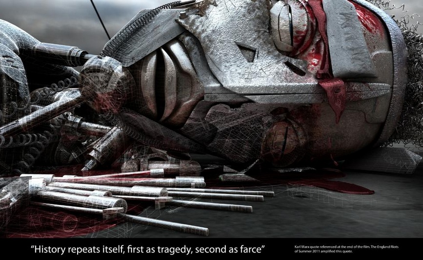 The quote that binds the riots of 1981 and the summer of 2011. This message reiterates the farce and lack of depth behind the Summer 2011 riots. Rioting for wealth and stealing of property instead of for your rights will never be understood or listened to. The understanding and depth that Kibwe Tavares has approached this subject, the inclusion of Architecture, History, Politics and Animation makes him a worthy winner and a role model for students who practice creative thinking for a purpose.
http://www.factoryfifteen.com http://www.bartlett.ucl.ac.uk/ As current global situations stand things aren't exactly great. There are uprisings in the Middle East,anti-capitalist protests in the Western world and an uneasy time for anybody within the Eurozone. Is Modernity, and everything fruitful that this wondrous object brings, possibly the root of this demise? Modernism has somewhat influenced capitalist needs and desires in relation to the way we idolise the aesthetical appearance of objects. To further define this just look at the I Phone/ I Pod/ any Apple product and the aesthetic allure this has on mass consumerism. 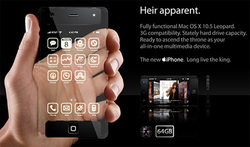 I-phone concept: We all want it because it looks good and yet arguably we forfeit functionality. It is questionable whether this desire to conform to mass production leads to a very vein and benign design process. "There is in true beauty, as in courage, something which narrow souls cannot dare to admire." (William Congreve: English Playwright and Poet). This lack of courage and risk taking leads to a design that aims to please and not serve. The very fact that hardware is held back on the Iphone, albeit old technology, (like a flash camera on the 3G when flash cameras have been around on mobile devices for over 5 years) and then promoting it as a new feature on a new version of the device. This almost disregard for form over function means that we take 2 steps back in a time when we should thrive on innovation. However like lambs to the slaughter (myself included) we consume these products to enhance an image. An image that is led by this need to fit in. This whole need to fit in and be liked by material worth makes us vulnerable. It makes us vulnerable to the CEO's of these companies, it makes us vulnerable as consumers and makes us vulnerable as human beings. Decisions on purchasing products are made by pumping money into adverts, by misleading the performance of such products, and by making us feel insignificant without this device. I feel a need to go back to basics. To go back to an age where effort and intuition was rewarded, a time that relied on simplicity and basic human needs. A phone is a phone so therefore it shall call people. A building is a building so therefore it shall cocoon people with a sense of warmth, hygiene and security. If you look at such works from the likes of Buckminster Fuller, that based themselves upon shelter and philanthropic morals, then you will see what I mean. We are all guilty of designing to please, to make money, to get our 'big break', but there must be no greater feeling than to design for humanity, for a cause and for a reason. I beg you to consider these thoughts as designers, as sculptors of tomorrow, and as the foundation of mass consumerism to think twice before you make it look all nice. 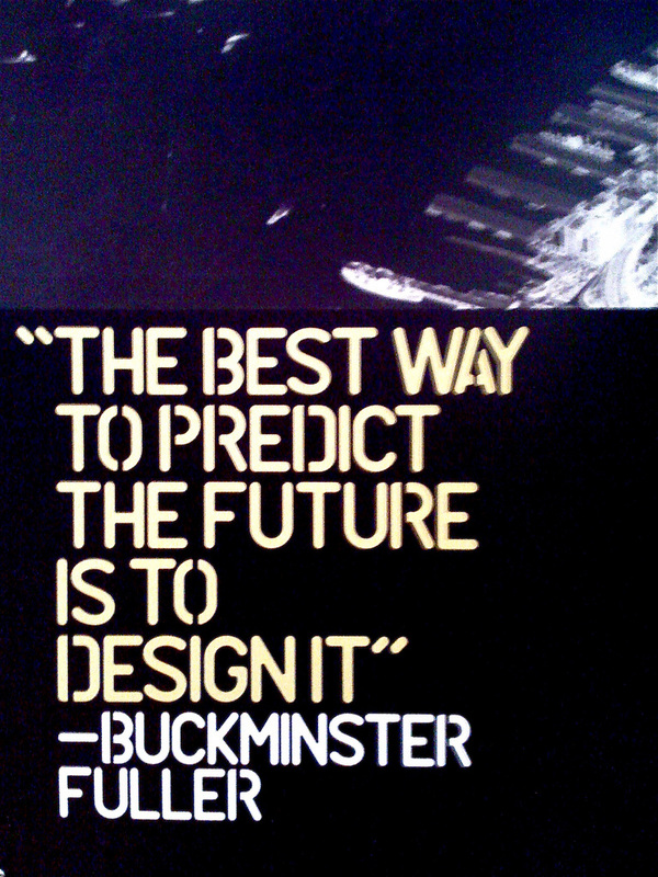 A mantra for risk taking. The London 2012 Olympic Games are upon us and already there has been a few mishaps. In terms of design the games have been a success with Studio Barber Osgerby's fantastically designed torch. Not only a wonderful sculptural form but symbolic with the each of the 8000 holes representing all of the torch bearers. The games are open, vulnerable and that makes it prime target for cynicism. 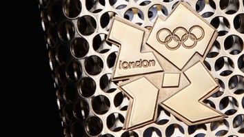 Cynicism is one of the greatest characteristics of British humor. It, along with sarcasm, is what separates our comedy and culture from our cross Atlantic buddies. It is to be expected that the Olympics being held in London, in one of the worst recessions in recent history, was always going to be subjected to ridicule. Even before any plans for the games had been released, it was already rumoured that the budget was so low that the opening ceremony would just consist of Ray Winstone flicking the stub of his cigar into a disposable barbecue lighting the Olympic flame. 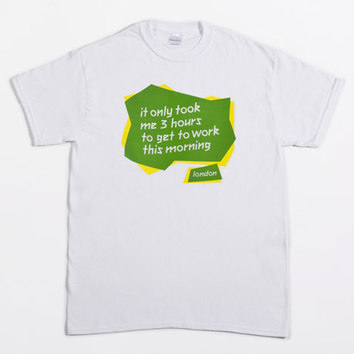 Cynical shirts on sale at the Dezeen Superstore in Monmouth Street, London. An eclectic mix of cynical memorabilia is available as seen above, and this is albeit very clever and true. The Olympics will make travelling in London via any mode of transport a near impossibility. It would be actually quicker to walk to any destination and it's free. Although if you really want a value for money bus ticket London is currently the place to be. The opening ceremony hasn't even commenced yet and the games has already been subjected to its first piece of controversy in the Women's football. It seems that the football organisers didn't pay too much attention to Geography or Historic conflicts getting the North and South Korean flag mixed up. Talk about a big whoops...  This is the North Korean flag.  And this is the South Korean flag. Next time just remember that the North Korean flag looks like the Texaco logo. A lot of people have been asking why the football has started early. Well you see these over glorified, over pampered pre-madonnas want to start early to get them ready for the opening of the greatest show on earth... The Barclays Premier League. To the delight of BT and Sky. 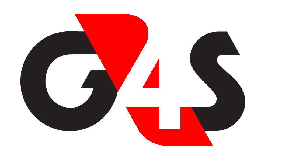 It's also great to know that the Olympics will be secure with thousands of our armed forces and security guards from G4S making sure that nobody enters the Olympic park with any unauthorised food and drinks. So much so that it now seems that the boarder gates are wide open to any 11 year old boy who wants an impromptu trip to Rome. I knew Ryanair were cheap but that's just ridiculous! 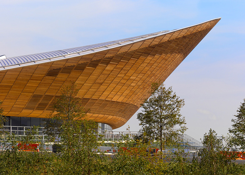 The Velodrome by Hopkins Architects The one thing that the above comments prove is that people aren't down on the Olympic games but actually just very annoyed with the fat rich idiots that make these decisions on behalf of us as a country. People that seem more concerned about getting Coca Cola as a sponsor and somehow trying to convince the nation that to get fit and healthy all we need is a can of Coca Cola. They might as well have had Tennents as the sponsor, it would communicate just about the same message but promoters would have so much more fun in the process. It would be fantastic seeing Usain Bolt just decimate the 100m record once again and just very cooly open a can of Tennents posing in front of a flock of cameras. I however would like to see beyond the politics, the money and the obscene attempts of the rich trying to get richer in one of the poorest parts of London. I say that the Olympics has already been a success in terms of the design involved. 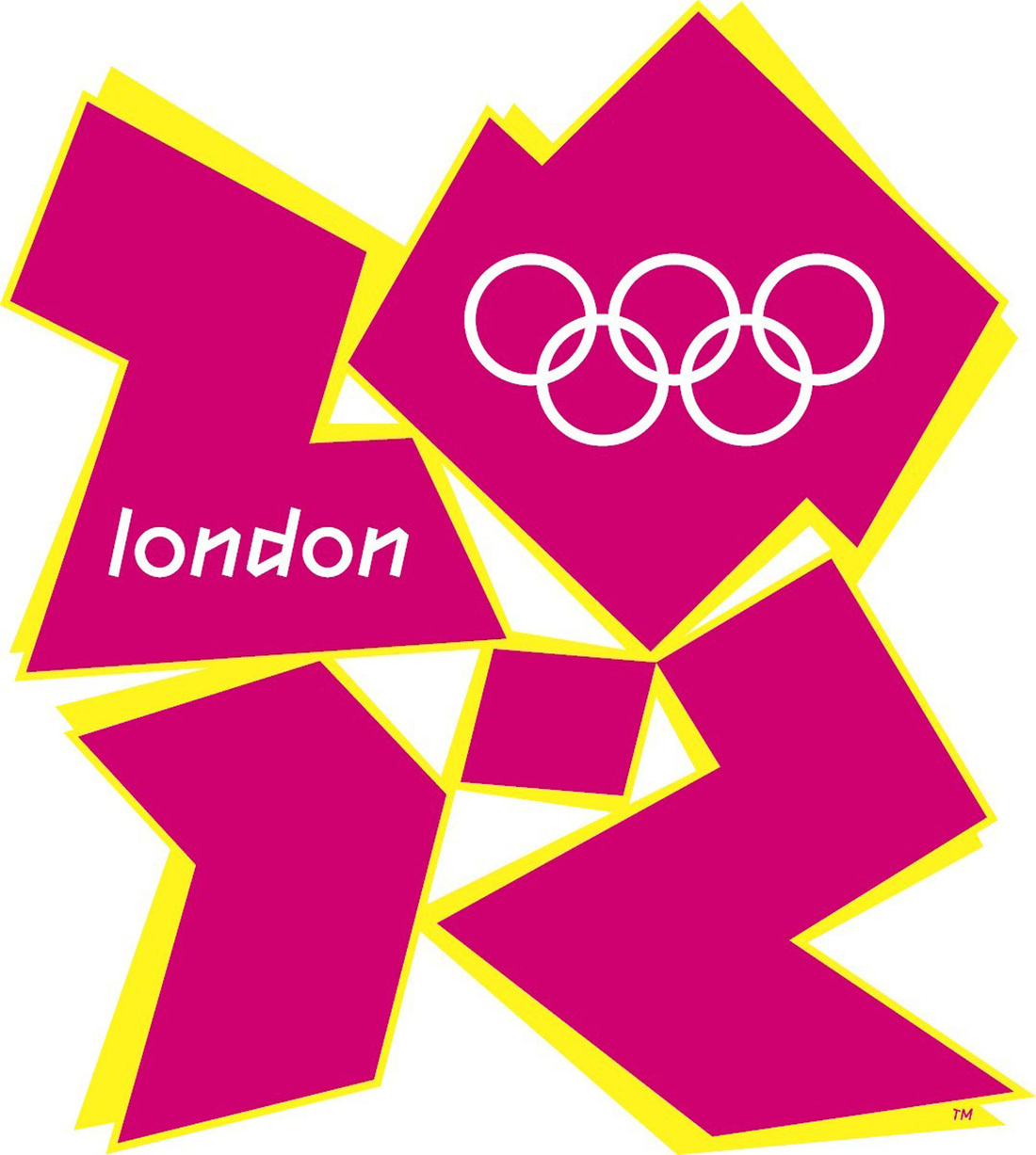 The official logo, by Wolff Olins, has come under tremendous stick from a variety of people globally. I personally think that doing something like this was a risk and people don't like it because it's different and has actually been designed. In a society where we think that Primark is high-end this would obviously really not communicate to the masses of idiots. Let's just look at previous Olympic logos, I know which one I prefer... 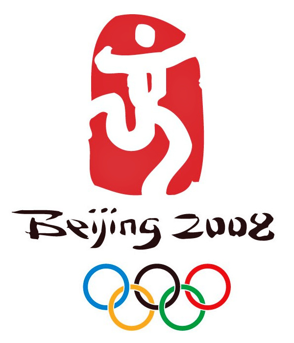 Mr Fantastic celebrating the bendy leg race win.  Again with the abstract person celebrating. The London 2012 logo breaks the mundane past of previous generic logos, it pushes boundaries and questions the importance of design. It may not be loved but people automatically know what it means and what it's for, which is exactly what the organisers wanted.
We have managed to create some iconic architectural pieces and regenerated a deprived area of London. The proof of this investment will only be credible and visible in the actions that happen after the games have finished. We don't have a spectacular stadium like Beijing's Bird Nest, but then again China had an agenda to announce themselves as the emerging superpower and to show the west it had something to worry about, we don't need to do that. We will always have the politics, the scandals, the cock ups but then again so has everyone else. We should be proud and optimistic for the revenue, the international investment and worldwide presence the Olympics will bring to London. Cynicism makes us laugh, it pokes fun at society and those who run it and truthfully we all need it. Roll on the games! 5 more of the 20 concepts for my MA final project have been completed. The concepts are being used to create an online virtual retail space that is tailored to the individual music needs of each person that visits the site. We can relate certain colours, patterns and textures to certain types of music. What interests me is why different people like different types of music. This has a lot to do with social and cultural situations but also to do with chemical reactions that get sent to the brain. Each concept is designed to attract and entice that individual to that specific space. 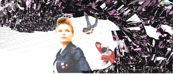 Punk Rock 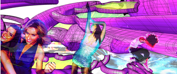 Trance. 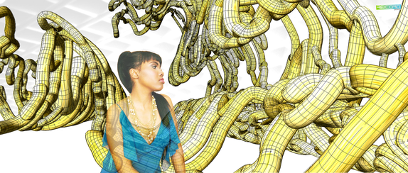 R N'B 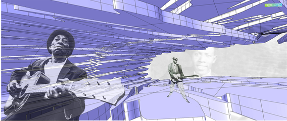 Blues 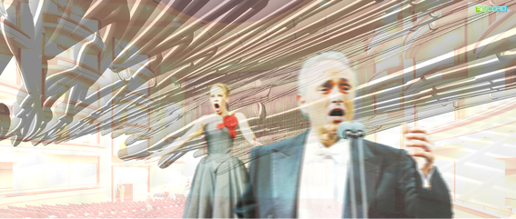 Classical 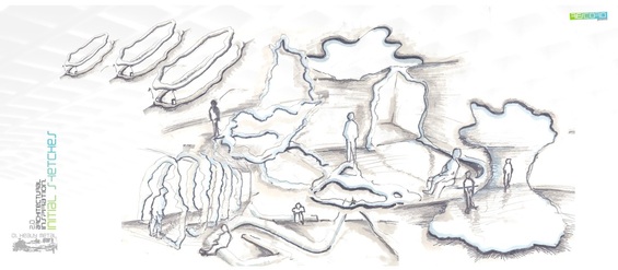 After a series of experiments involving chemical reactions, 20 of the images taken were then assigned to certain genres of music. I have set myself the task of completing 20 concepts in 20 days. These are the first five. The initial inspiration images were cropped and enlarged to zoom in on certain interesting forms and patterns like the one shown below. 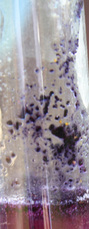 These images were then converted to black and white images. This was done because the dominant aspects of the image are made more clear and can be easily used as a guide for drawing over in 3D software. These converted graphics look like the following... 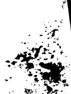 As you can see by applying this method the forms become strikingly clear and create a very good base graphic for concept inspirations. The 5 genres of music I will be showing you in this post are the following:
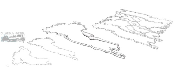 The concepts began by initial sketches (seen at the top of this post) there was one for each concept. These give a general feel for form and the overall functional and aesthetic outcome desired. The next stage (pictured above) was to pick out certain forms from the inspiration images. By creating a series of closed curved lines in Rhino and then using the 'PIPE' command to give the line solidity and form, I began creating an identity for each of the music genres. 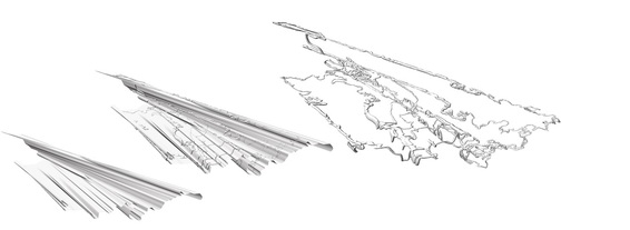 The graphics were then used for inspiration to create 3D structural forms to wrap the piped lines across. By using 3 lines from the graphic for the X,Y and Z axis and then applying the 'LOFT' command, these structural forms were created. The next step was to the use the 'FLOWALONGSURFACE' command which applies the piped form across the solid structural form. The next step then is to delete the structural form so you are left with this abstract form inspired by Heavy Metal music. The Next thing to do then is get right into this forms and Photoshop people and related bands in to really get a feel for how these virtual music interiors will look like. The results for the first 5 concepts are as follows:  01:Heavy Metal 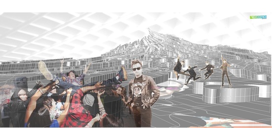 02:Rock N'Roll 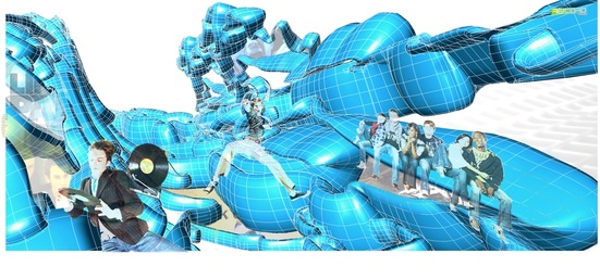 03:Alternative 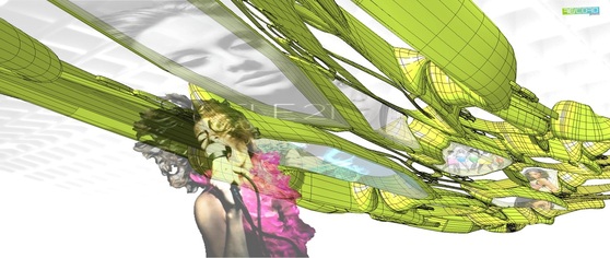 04:Pop 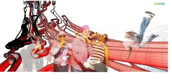 05:Rap 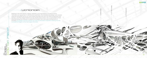 Inspiration Booklet- Montage of Christian Precht's Voronoia The stage between research and inspiration moving into creating concepts and then 3D visuals is a tough one. You ask yourself questions like.. How do I generate ideas from my research? Well look at the image above. This is from my MA Inspiration Booklet entitled, The Manifesto, it is of Christian Precht's Voronoia concept. This form has ultimately inspired the following process you are about to see. Ok so I have these organic forms with abstracted circles as my inspiration. I almost always usually draw a quick sketch to envisage what the render will look like and therefore the direction I want to go with this concept.  Quick sketch of envisaged concept As you can see the image to the left is that very quick sketch. This took no more than 15mins as they are used not for presentation purposes but for a rough guideline to how I want the 3D CAD concept to somewhat look. Now it's time to create CAD concepts using the above images as inspiration for forms. My CAD program of choice is RHINO 3D. It is a modelling tool which can handle creating organic forms effectively. You can do similar things in 3D Max but out of personal preference I use Rhino. A free trial version of Rhino can be downloaded at www.rhino3d.com. 1. In the floor plan view create your 2D abstracted line using the control point curve tool. 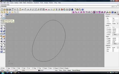 2. Then using the PIPE command create the 2D line into a 3D form. 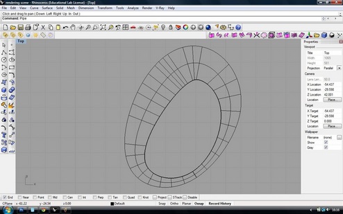 3. Repeat pattern as required to create different forms varying in shapes and sizes. 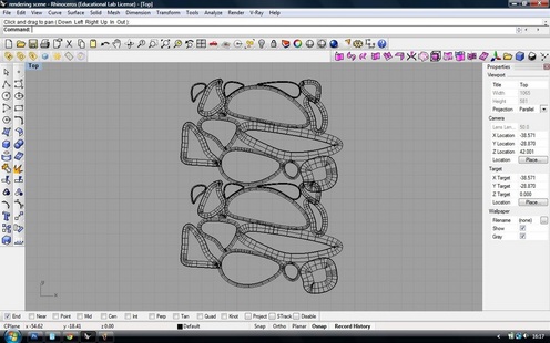 4. Then using the line tool create a box around the perimeter of your pattern. Then use the Command PlanarSrf to turn this into a solid 2D shape. (We need this box when projecting this pattern). 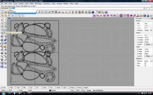 5. Create a solid 3D shape. This is used as a support structure when projecting the pattern. To do this create a few spline lines and use the command Loft to join the lines creating a solid shape. You are now ready to project the pattern to the surface you have just created. 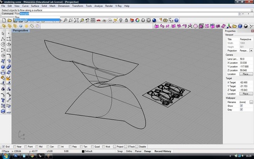 6. To project the pattern use the following command. FlowAlongSrf. Highlight the pattern (not the box surrounding it) with the cursor. Follow the instructions in the command box. It will then ask you to select the box surrounding the pattern. The next step is to then click on the shape created in the previous step. Click Enter. 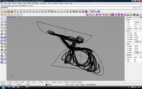 7. Delete the solid shape previously made. 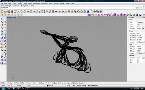 8. Then you are left with your form that has been stretched along the surface of the 3d shape made. All that is left now is to create a scene to render. 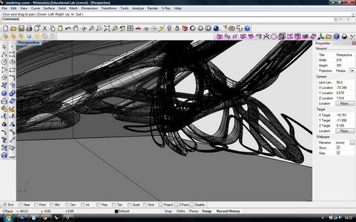 9. By creating a box enclosing the form you are creating a scene that is suitable for rendering. To render I used the Vray for Rhino Plugin available from www.asgvis.com. Set the materials you want by using the material bar in Rhino (Right hand side of screen under materials) and then turn the ceiling of the box into an emissive material in the Vray Material editor. Therefore you are creating a scene with lights that replicate interior down-lights. 10. Change the render settings to Studio Print Quality in the Vray Options menu and click render. I have assigned HDRI settings to the materials to give them that extra photo realistic look. 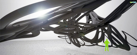 And there you have it. With practice and time this is very easy and adds a whole new depth to your 3D skills.  View of site location with Rotunda left. Ok so I am at that point in the project where all my research montages are done and I am ready to start the concept stages of the design process. What I always do first is to do a 3D mock up of the site location to get a good idea of the area I will be designing in and the area surrounding it. This is relatively simple and adds a great professional look to your work. This is how it's done. 1. Go to Google Maps and find your site location in the viewer. www.googlemaps.com. My site location is the Black store which is just across from the Pavilions in Birmingham UK. You will have to Print Screen and crop the image externally as there is not an option to save direct from the website. 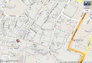 Google Map View. 2. Open this up in Sketchup Pro. Go to: File>Import find the directory where your file is saved in and change in the drop-down menu frrom .skp to .jpeg and your file should become visible. Click Insert. 3. Once Image is inserted you need to change the view to plan view and the camera to parallel projection and not perspective which is on default. To change this go to Camera on the toolbar and de-select Perspective view to Parallel Projection. 4. Once this is done you are ready to trace over the image using the line tool. Once all is done go back to perspective view and start extruding the solid shapes accordingly. 5. Your model should look something like this: 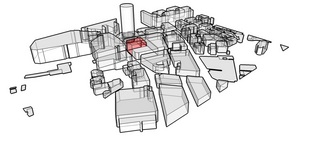 6. It is now time to get a more professional look than the standard Sketchup view-port has to offer. To do this we need a rendering program. The best by far is Vray for Sketchup and a 30 day free trial can be downloaded at www.asgvis.com. 7. Once the Vray plugin is installed you can begin assigning realistic materials. Click on the Vray material editor and start playing around with the pre-programmed materials. 8. Use a higher render setting to achieve the best results. I have given the building I am using a soft red emissive glow to indicate its importance. 9. The renders below show the 3 phases to my site development. 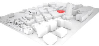 Phase 1. 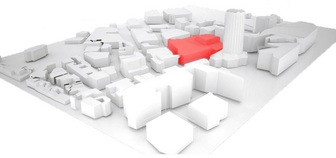 Phase 2. 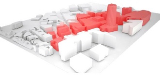 Phase 3. |

Designer. Did a blog. Starting blog again. Early Thirties. Like Food. Like Drink. Like Music. Like travelling. If you like this blog get involved, comment and send me a story or a product, lifestyle, or way of life to promote.
  |
||||||||
