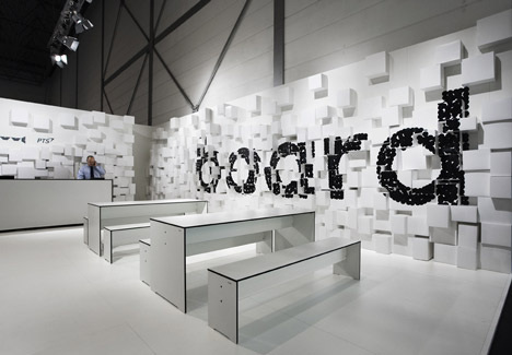
I came across this Exhibition Design by the German Studio D'Art and was taken back by the simplistic effectiveness of the scheme. 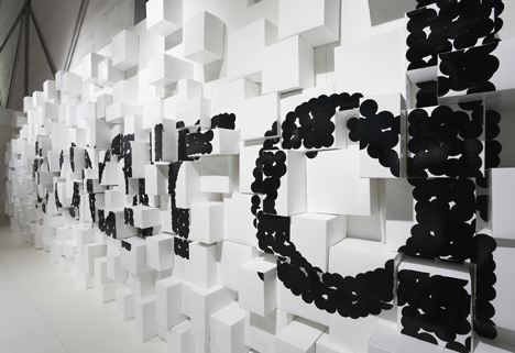
The wall is scattered with a series of sprayed white boxes that differ in size creating an undulation texture to the wall that gives the impression of staggered extruding. The company's branding is presented on these undulations in black circular stickers that stands out on the white wall. 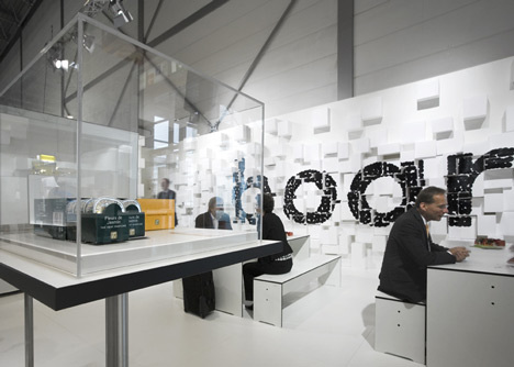
The area was divided into different zones. Part exhibition of products displayed in acrylic boxes. An information area for those who required more info on the company and its doings and finally a meeting area where representatives and potential clients can talk and discuss terms. The seating adopted is a laminated matte white bench style seating that has a beautiful black trim to the chamfered edges. 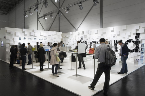
0 Comments
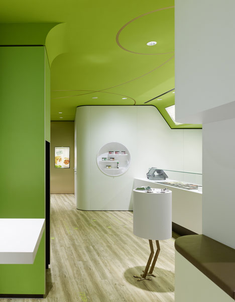
This restaurant design by Stuttgart based designers, Ippolito Fleitz Group, is an eco inspired design that takes elements of forest life and nature to create a contemporary and minimal dining space. 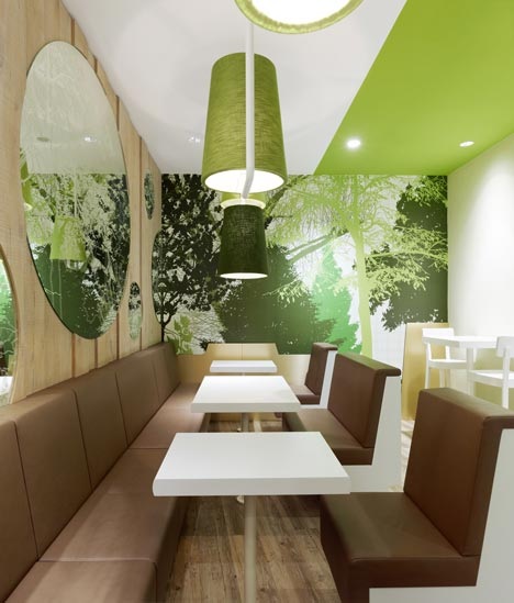
The bespoke built in seating is upholstered in what appears to be in faux brown leather and is contrasted by neutral white cheeks that make the upholstery the prominent texture. The leaf green walls and vinyl graphics that depict forest landscape scenes tie in with the autumnal coloured upholstery to give an overall natural feel to the Interior space. 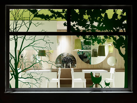
This theme extends to the exterior of the restaurant where vinyl graphics of trees and woodland creatures create a mystic yet inviting feel from the street side. 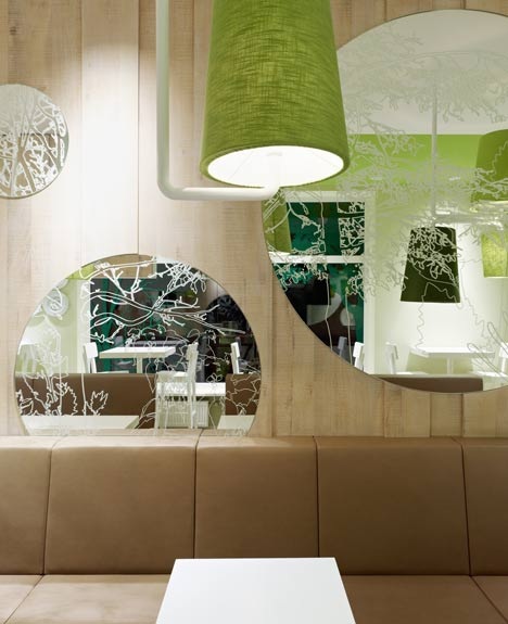
The circular mirrors within the Interior also carry on the forest theme with sand blasted motifs that add an element of intricacy to what is usually a mundane material. The timber effect walls are a material metaphor for woodland, the pendant light shades and painted walls represent the green of leaves, and the neutral white tables stand out amongst the browns and greens. 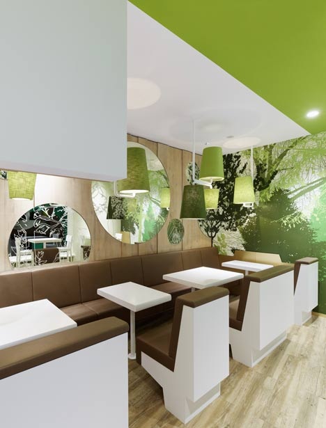
My opinion on this design is split. From a designer's point of view I admire the contemporary clinical feel of the space. The edgy and angular features give a sense of masculinity, whereas I find the white tables very hospital chic. From a visitor's point of view I wouldn't feel comfortable, it lacks a sense of homeliness and comfort, it's a McDonald's on the Rivieria with a tidy budget. I want industrial features an open fire and seating that comforts me as opposed to ones that are continually reminding me that I should leave in 10mins or so because my backside has gone to sleep. I'm split...
Hallo und herzlich willkommen German Design Monat! You may have guessed from the title, and if you can understand the German above, that we are moving slightly East of the Netherlands and focusing this month on the wonderful world of German Design. Stay tuned for lots of new Designers, old Designers and everything weird and wacky from Germany and again we hope to make more International friends along the way. 
|

Designer. Did a blog. Starting blog again. Early Thirties. Like Food. Like Drink. Like Music. Like travelling. If you like this blog get involved, comment and send me a story or a product, lifestyle, or way of life to promote.
  |
