Photographs by Jeroen Musch.
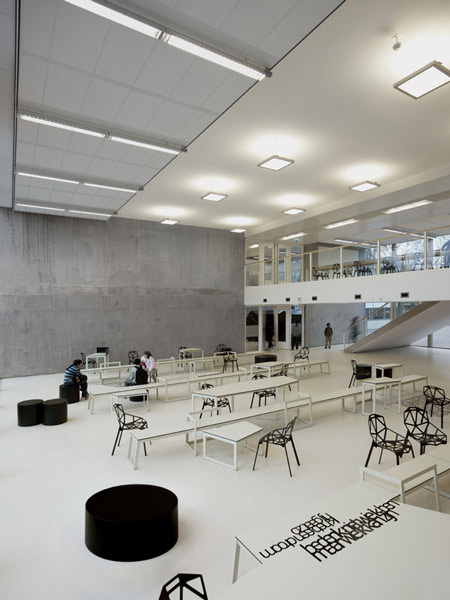
‘Gossip about me, but don’t tell them the truth. Make them believe something bigger’ Just one of the many poems that inspired the Dutch creative team of i29 Interior Architects for this school in Amstelveen in the Netherlands. These were poems inspired by school life full of highs and (mainly) lows. Written by Dutch Poet Erikjan Harmens who then converted these poems into 'carpets of text' onto the matte white floors and concrete slab walls 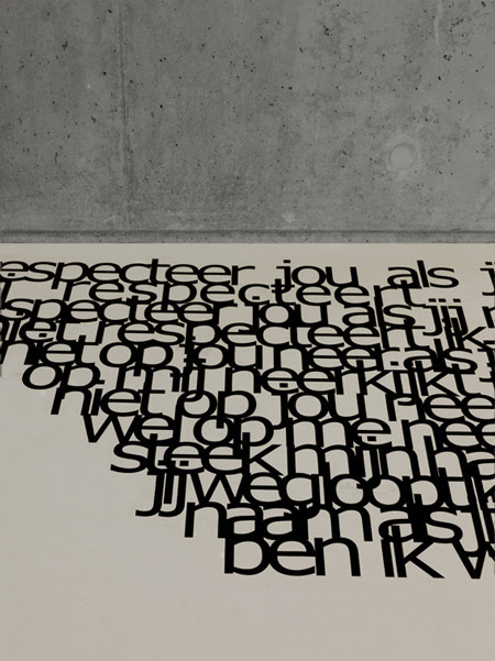
The vinyl black letters are a stark contrast between the neutral floors and create areas of interest that divide the Interior up into workable zones. This juxtaposition of colours continues through into the feature furniture using the modern day classic 'Chair One' by Magis. This colour scheme gives a sense of sophistication along with the vast areas of open space. The typical grid ceiling features converge into a flat matte white plastered ceiling which eliminates the standard feel of quickly built, poorly made school environments. 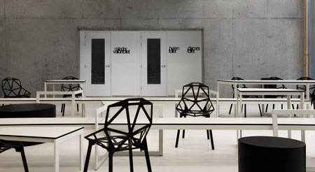
It all blends together in a cohesive fashion. I for one would feel inspired and happy to have gone day in day out to a school like this. We are so used now to seeing these vast academy schools with bright colourful interiors that are psychologically used to evoke a certain concentrating and calming reaction. This adult colour palette is therefore a welcome introduction to the norm. 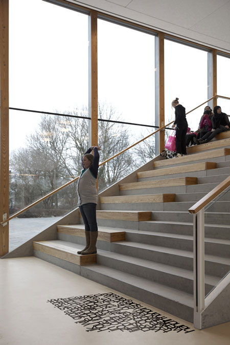
It is however not so pretentious and beyond its years that you can't have fun in the space. The picture above shows the divide of the staircase which is split for a circulatory purpose and equally for a rest, sit and relaxation area. Sitting on public stairs is traditionally a bit of a faux pas, but here it is the social norm. Interiors are seldom seen as a 'you should look but not touch' but we should encourage interaction and the break of social boundaries especially within educational environments. 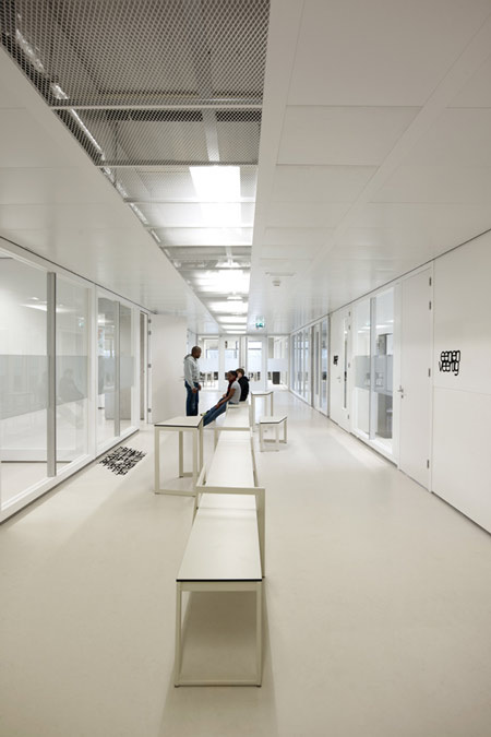
The school corridors have a sense of purpose and this image shows the play on one point perspective as a means of guiding yourself down the corridor. The half exposed and half unexposed grid ceiling again relates to this contrast in mood and expression. There is a sense of contemporary honesty to this Interior that is undoubtedly modern but is almost embarrassed by it, and therefore feels the need to expose the 'nitty gritty' parts beneath.
www.i29.nl/
0 Comments
My quest to find a fantastic Indie Dutch band is now complete. This catchy little number will grow on you. Guarantee you will be whistling this whilst walking down the street and singing it in your head. It's mellow, unassuming and authentic. Listen and Enjoy.
And the Award for the Best Dutch Interior 2012 Goes to... Drents Museum by Erick van Egeraat.10/23/2012 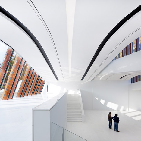
Came across this today on a feature dezeen.com are doing with their coverage of Dutch Design Week in Eindhoven. The best in Dutch Design was announced yesterday and I was very interested in the winner of the Interior category. 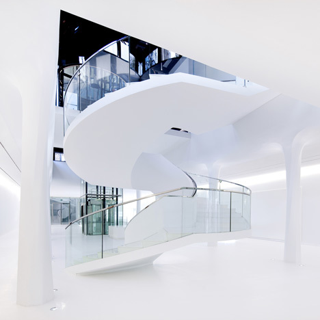
I was intrigued by its overtly clinical feel. There is a sense of cleanliness about it. As if you should be wearing hazmat suits that get sprayed down whilst you walk through pressurised chambers. I can't say whether I like it or not. I know that museums capitalise on attention by having neutral walls and letting the objects of desire protrude in all of their glory from this neutrality, but it just seems too precious. 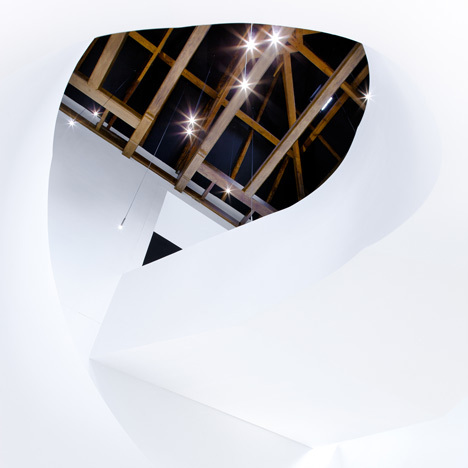
There are areas though that really excite me. The contrast of the overtly white surroundings diverges well with PAR timber beams and roof trusses and gives me that sense of character that I didn't feel I was getting from a lot of the other stills. I like refinement but albeit refinement that doesn't hide too much away. I like Interiors with blemishes, exposed brick walls or beams with all of their imperfections and glory. 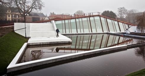
The exterior is a biologically friendly dream that seamless sculpts into the undulating contours of its surrounding. It doesn't extrude above the ground at any great height, it optimises the lower floors to minimise on visual impact to the surrounding Dutch vernacular buildings. 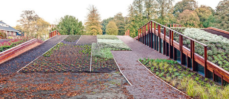
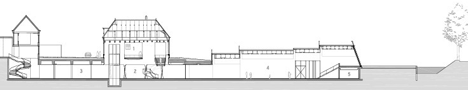
The uninterrupted transition between the old museum facade and the new museum is one of joy. It blends together superbly and is a fine example of the current trend of the old playing nicely with the new. This is no more than apparent in the recently opened, and heavily publicised, Stedelijk Museum. 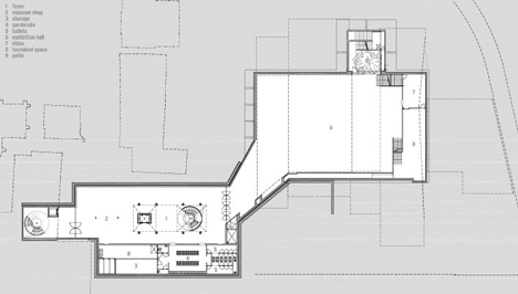
To read more on this building see Dezeen's fantastic blog entry...
http://www.dezeen.com/2011/10/27/drents-museum-by-erick-van-egeraat/ 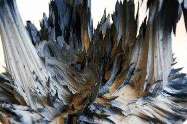
Jolan Van Der Wiel- Courtesy of Core77
Part Industrial Designer part Artist, Jolan Van Der Wiel is causing a stir with his experimental and creative furniture. The creative process sees a machine consisting of high powered magnets supported by weights, and a metallic mixture that attracts to the magnets and hardens. The video below (by Core 77) explains the process by Jolan himself. The fascinating process sees a twisted, unconventional and awkward end product that each has its own individual twist to it. Not one is ever the same and therefore in a relatively simple process you get a bespoke piece of furniture. His most notable piece is the 'gravity chair'. The images below (Core 77) are just stunning. 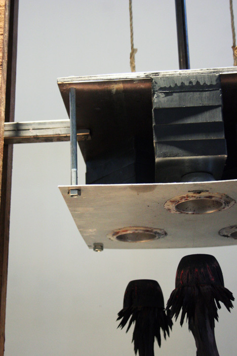
The magnetic contraption at work.
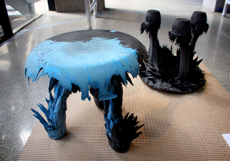
The outcomes vary each time and colour can be added to create even more of an effect.
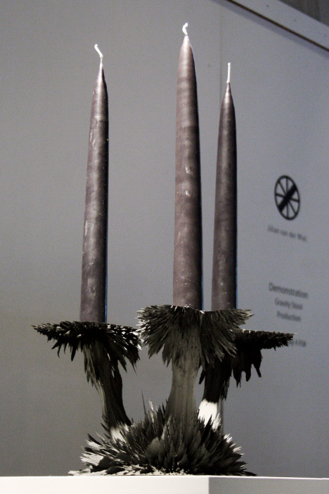
The possible outcomes aren't just chairs, just have a look at this candle stick holder.
More Information on Jolan can be found at: jolanvanderwiel.com/
Dutch Design Week is upon us and will see the best examples of Design from around the world and the Netherlands come together in Eindhoven. 
We will be focusing a bit more on some of the Designers at the forefront of the Design week in closer detail in coming posts. The show boasts an impressive collection of 1,500 Designers showcasing work from an eclectic range of subjects ranging from Industrial Design to Spatial Design. 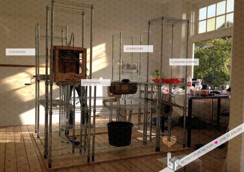
For me one of the most intriguing aspects of the show will be the 3D print cafe (pictured above). This gives visitors the chance to bring along a plastic bottle and recycle it into a new product like a piece of jewellery or a small household item. This quirky idea will spread the ever increasing popularity and functionality of the 3D printing era. My predictions are that the next age will be the 3D printing age as opposed to the age of the Internet in the previous generation. The more that this fascinating technology can strike a chord with the general public the better. For those of you who are lucky enough to be going or live nearby, a Google map is below to show the location of the 3D print cafe. Dutch Design Week runs from 20-28th October throughout the city.
For more Information Visit: http://www.ddw.nl Lost in Space by Dutch Indie band, Ghost Trucker, is a psychedelic acid trip through space. A slow tempo, sci-fi style synths in the background and an equally weird and wonderful video, creates 3:42 of chilled out pleasure. By far one of the best Indie bands from the Netherlands I have come across to date. 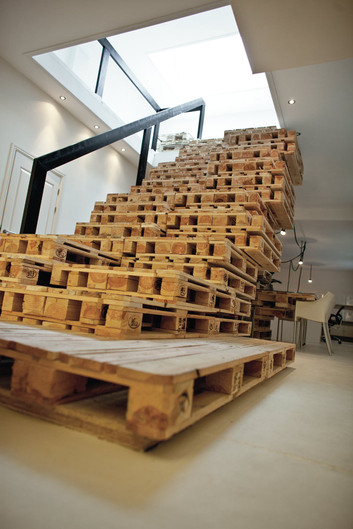
Dutch based Designers, Most Architecture, have created a fantastic temporary space using a material that not only possess structural qualities but is widely available. The whole office interior was constructed from recycled crates that are sporadically and strategically placed to form work desks and even a feature staircase. 
The space is divided into areas that include an entrance area, general work areas and a presentation room. The presentation room is divided by a series of glazed screens with mullions that match the neutral colour scheme of the internal walls. 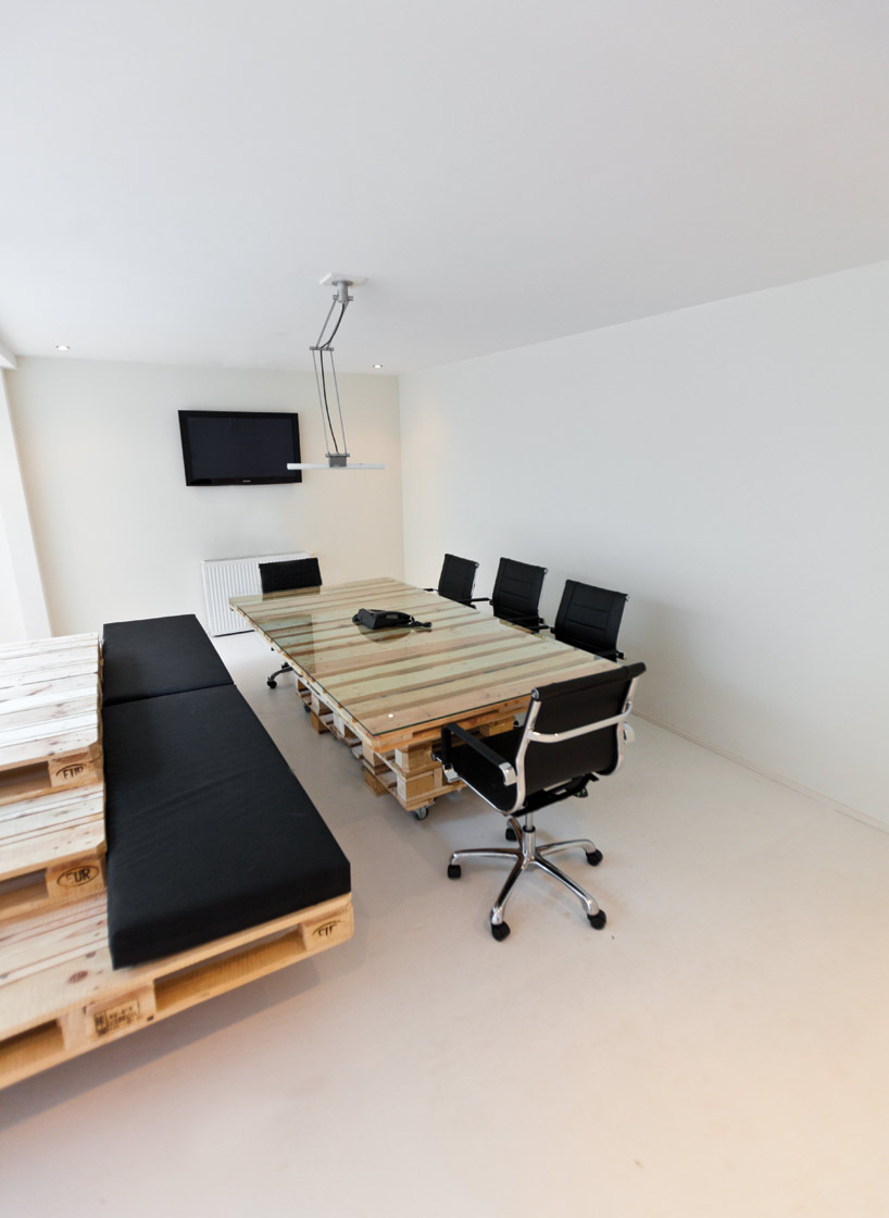
I find this design an excellent example of how flexible materials can be. All it takes is some imagination and creative thinking and by letting the crates dominate the space in contrast to the white walls, means that you can have a high end interior for a low end price. The chocie of furniture used also highly compliments the Interior ambiance, especially the Herman Miller office chairs which are extremely comfortable and excellent for maintaining a good posture. 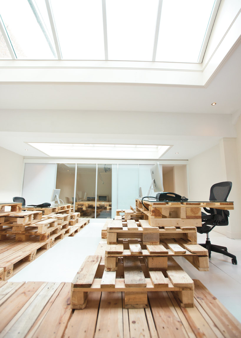
For more information please visit: http://www.mostarchitecture.com/
or: http://www.designboom.com/weblog/cat/9/view/11649/most-architecture-brandbase-pallet.html 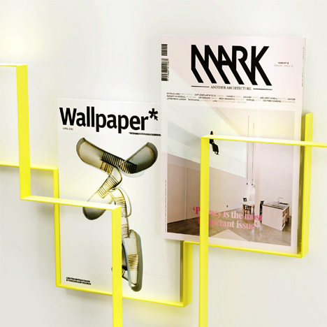 Magazine Rack, 2010. Instead of focusing on the well known and the well established Dutch Designers, I thought it would be more interesting to delve into the new emerging stars of the Dutch Design scene. Frederik Roije definitely can be filed under that prestigious and exciting category. His edgy designs have a sense of mystic modernism to them which most certainly fall under the design style of contemporary cubism.  Rocking Squares, 2009. This stylised approach is displayed in the image above. A de-constructivist's approach to a timeless children's toy. It looks unnerving, uncomfortable and uncharacteristic of what we usually define as a child's toy. 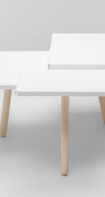 Tablefields, 2012 This over complicated cubist style is counterbalanced with other projects that are elegant, graceful and pay homage to materiality and craftsmanship. There is still no loss in quirky characteristics to these more timid pieces and they actually compliment the cubist pieces eloquently.  Square chair, 2009.  Frederik is one of the many new and emerging talents coming from the Netherlands. Keep posted to further blog posts for more new Dutch Designers.
For more information: http://roije.com/# The Dutch don't have the most celebrated music scene in Europe and subsequently this means a lot of the bands blend into the background. However one of the few modern day rivals to this argument are Racoon. Open your mind and Close your eyes, it's a very good song and you may just like it. 
Own Photo-
On a recent trip to Amsterdam I came across this stunning building on Amsterdam's harbor behind the Grand Centraal Station. I was taken back by the unconventional exterior with its undulating angular cladding. Delugan Meissl Architects, originating from Austria, say that their inspiration for the building was to create a 'psychological effect' that cinema goers experience. Space, Light and movement. 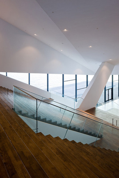
EYE Museum Interior- by Evolo Magazine.
The exterior cladding reflects light in constantly changing ways depending on the weather and because of its angular qualities the shades of white change giving the building depth and a rather masculine presence. 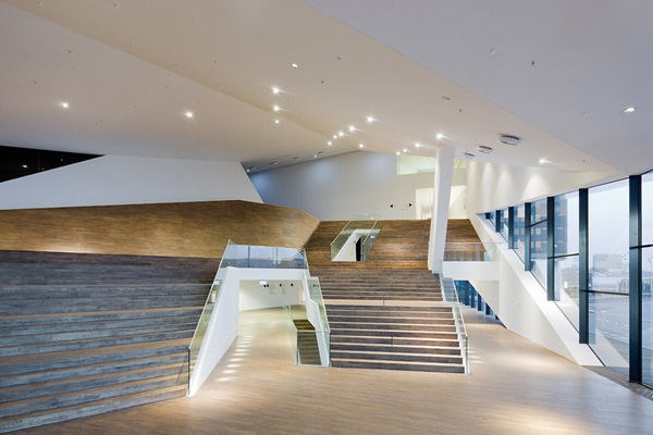
The Interior principles are very similar to that of the exterior. The angular effects of the exterior have an obvious effect on the ceiling angles of the interior and this creates a very sophisticated tiered effect. The wooden floorboards are placed at a 45 degree angle again playing on this precedent of angular forms and movement. It is by far nothing new or has pushed architectural boundaries but it is more to do about the presence of the building along a harbor that is becoming a shrine for iconic buildings. Renzo Piano's NEMO Science Museum is only a short hop across the water and the building work going on in the area is vast and inspiring. 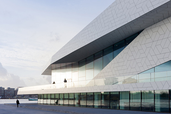
The Dutch have a fantastic design style that is typically bold and quirky but this building has all of that but presents itself in a subtle and graceful manner, imagine a ballet dancer elegant, soft yet surprisingly strong.... but loves a good McDonalds and that is the EYE Museum.
http://www.eyefilm.nl/en |

Designer. Did a blog. Starting blog again. Early Thirties. Like Food. Like Drink. Like Music. Like travelling. If you like this blog get involved, comment and send me a story or a product, lifestyle, or way of life to promote.
  |
