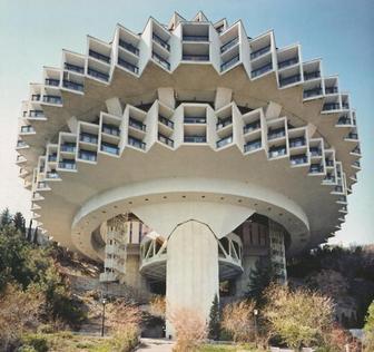
 The Druzhba sanatorium in Yalta, Ukraine. Communism and architecture are more widely known for social equality and state ownership, however Frederic Chaubin has recently wrote a book called CCCP: Cosmic Communist Constructions Photographed. It opens the eyes to the world that communism is/was not just about creating a singular class and common ownership of the state, but had more lateral 'utopian' visions. Normally commutecture is associated with square blocks and excessive useof dark concrete promoting a strong, physical, and industrial aesthetic. However this book reveals the exploration of the possibilities of the now frowned upon material. Concrete is very much the Marmite of design, it is un-ethical to use it but has been around for generations and for some people these brutalist structures hold a special place in their hearts. These structures to me represent a bygone era of political uprising and technological advancements. Technology was increasing at such a rate that scientists predicted we would be driving flying cars by the year 2000 and would have a population of humans living on the moon. This era represents so much more than political ideals, it represents a time when anything was possible. It's like that stage when you look back at your past and wish you were a child again, when you had no concept of life, no concept of money, and you played endlessly until your eyes slowly closed and you drifted into a magical kingdom. At this period of time anything was achievable and this ultimately drove people to progression. The space race was an example of this, it was fundamentally a competition to who was the most powerful country in the world. 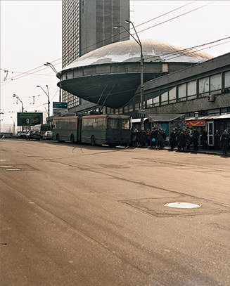 The Ukrainian Institute of Scientific and Technological Research and Development Communist architecture outlined in this publication shows that communist designers were able to make political structures that were modern and innovative. However, the forms are indeed in some cases organic and modern, but they still show signs of industry being the key driver of the overall finish. Rusting, hard and cold metals and filthy concrete symbolise the lack of expense involved in the finishing stages, no luxury items here. Communist architecture will never be as eye pleasing as he likes of Zaha Hadid's glossy neutral ambiguous designs, however they represent an age of ambition. An age where being nieve was king, smoking could not kill you and whoever had the most nuclear bombs was leading the world.... bigger was better. I feel somewhat we have lost this ambition and drive because we have no definition of who and what we stand for. Communists however right or wrong their beliefs were/are, they are fighting for a set of beliefs and this only strengthens and communicates the message that this group wants to get across. These morals should be used as a template of defining who we are as designers and who we are as human beings. We abide by a set of ethical laws that are recognised by the state so it is our moral duty as designers to create our own design beliefs, our own commandments and sculpt our own futures.
3 Comments
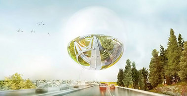 view of the hovering sphere from the highway- www.designboom.com Bjarke Ingels Group are proving again to be favourites in composing innovative yet buildable architectural, and in this landscape solutions. The pragmatism of their designs, the powerful graphical style of the comic obsessed Bjarke Ingels, really makes B.I.G stand out to a whole new era of architects. The Swedish Association of Architects announced a competition to create a 'super-junction' that would become a visual landmark in entering the city of Stockholm. The project was part of a collaboration with engineers Grontmij and Spacescape. The proposal included a large hovering mirrored sphere that reflected views of the surroundings creating a 180 degree view of the city. The sphere is composed of 30% photovoltaic panels which creates enough energy to keep it floating making it functional and self-sustainable. 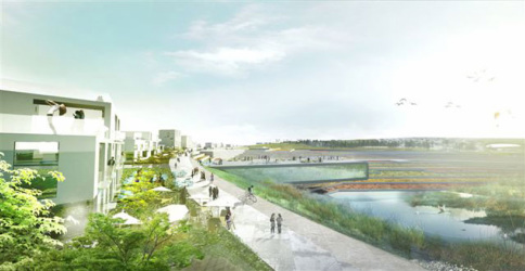 view from surrounding neighbourhood- www.designboom.com The plan is very contextual in terms of the design features and decisions made. The plan includes a slight raising of the land that minimises noise pollution for the surrounding inhabitants. This creates a bowl like area that provides a separation between the neighbourhood and the city creating land for natural wildlife and vegetation, improving the overall aesthetical appearance of the city and its surroundings. 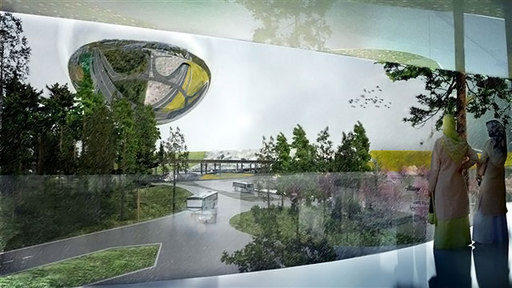 View of the sphere from one of the surrounding public buildings- www.designboom.com This project combines a variety of architectural and design practices ranging from landscape architecture, urbanism, ecological technology and art. These disciplines create social interaction between the city and resident. This kind of multi-disciplinary project shows the need for designers to be more savvy and open in regards of the disciplines they apply to any project. Being singular in Design can only lead to very contrived and singular looking outcomes, incorporating a variety of disciplines and influences will only make a project more spontaneous and useful for the people who will use this space. B.I.G Architects create this cacophony of comic-book induced graphical elements that coherently display the actions and reasoning for why certain decisions were made during the process (see images below). Speaking from a personal point of view Bjarke Ingels have had a very 'B.I.G' influence on myself. Jakob Lange, B>I>g partner and architect, presented at Birmingham City University 2 years ago and their graphical displays, innovative ideas and sheer 'coolness' really spoke to me. This was further recognised when I purchased their 'Yes is More Manifesto' which is bar far one of the best architectural manifestos I have read and is a constant source of easy-reading and inspiration. 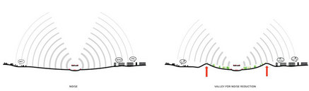 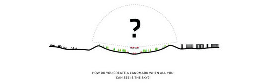 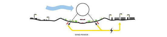 All images courtesy of www.designboom.com It's time to radicalise and ridicule some crazy design ideas that take modern designs and come up with an alternative means of using or operating them. This month's design is the manually operated tilting train or the MOTT as it is more popularly known. The idea is that the passengers control the train by running to either side of the carriage to tilt the train around corners. The passengers are notified of an upcoming tilt by a flashing screen that flashes red and green. Red indicates that there is a tilt coming up and green indicates to tilt now! Coincidently red also means to exit the train immediately due to an impending collision. Paper Planes have an exclusive image taken from the MOTT secret testing facility in Banbury just off the A442. The tests were a huge success as the picture below indicates. Only 43.5 people suffered major or severe burns and needed immediate medical attention.  Initial tests were a huge success. The official blurb on their promotional material states "Manually operating tilting trains are 100% safe and in a recent survey 64.3% of 1 persons asked agreed with that statement 100%." Those are some solid figures that show the overwhelming public need and desire for more interaction with public transport. A spokesman for MOTT when interviewed talked of the social benefits of such an innovative idea. "We have seen people fall in love, get closer to each other and last week we had our first proposal in the carriage, better seating. The journey not only provides a means to get from a to b but c to d also. Long gone are the days of isolation and unproductive conversations on public transport, the MOTT provides a breeding ground for intellectual articulate individuals who want conversations with strangers that will stimulate and educate." We have been provided with an image taken last week of a great conversation that took place mid-tilt! 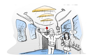 Did we mention ground breaking Interiors also? Without a doubt Paper Planes will be keeping a keen eye on the progression of this radical new idea that will be coming to a track near you very soon. Prices start from £443 per person per stop per year per carriage and includes free accident insurance. If you were wondering how the engineering of this design works we have absolutely no idea! That was an official quote off their unofficial website However their crack team of crack heads have provided us with some detailed section drawings showing the train when on the flat and when being manually tilted. The design is so complicated and ingenious that apparently there has been no words yet written to describe the technology used.... Truly amazing. 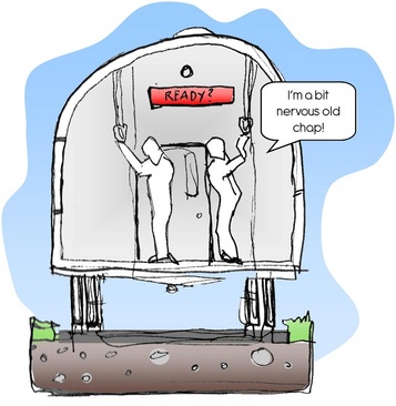 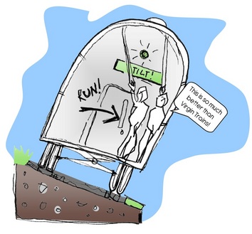 When I think of Interior Design I think of expression, creation and liberation that incorporates a plethora of tonal colour, an understanding of how materials relate to environments and human beings and how we gracefully create spatial elements that work for the inhibitor of that space. Fundamentally Interior Designer's are space makers. They craft a precise slice into an existing area which transforms a space to a fully functional machine that works for all. Take away that machine, that desire for progression, that eagerness to create an aesthetical beauty and you take away the very ethos that the industry is built upon. We should be encouraging each and every designer no matter what proffesion to be ground-breaking, to explore creatively, to create their own manifestos and mantras and not regurgitate other people's mantras. Where will the next Heatherwick, Novembre, Foster be found if one does not understand who they are and what they want to achieve in a design world that is clouded with regurgitating already conquered conquests? For example what else can be done to revolutionise a chair now? Instead of designing chairs we should be creating the chair of the future. Chairs are simple and functional. Their primary use is to be sat on for comfort. There are chairs for the office, chairs for a car chairs for almost everything. But when does a chair not become a chair? If you change the primary use then a chair becomes uncomfortable. If you change the primary use again then the chair becomes unbearable to be used for it's functional purpose and therefore you have created a sculpture. I want more sculptures... please.  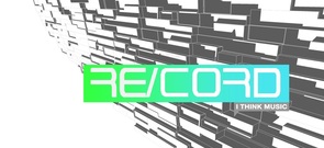 For my MA final project I am looking at re-inventing the high street as a virtual entity. Mixing digital design, technology, web power and Interior Design as a means of fully replicating the cities we know and love into a virtual high street marketplace. This is the future of high-streets and this is a narrative from a time traveller telling you why... "What is Re-Cord? Re-Cord is part virtual design, part guerilla hijacking marketing stunt. It liberates the mundane physical high street into a virtual replication that is not limited by budget, physics, building regulations or materials. It uses the floor plans of already existing physical high street stores as a basis for replicating exact models of these plans in a virtual online environment. But why do this? I live in the year 2030, I have seen the rise and fall of the once powerful high street. I have experienced the days when people used to queue outside of stores a day before the release of a new product or long awaited album. This no longer exists... The digital era started to take-off in the early 2000's some thirty or so years ago. There were websites such as Amazon that meant thousands of products could be viewed and purchased at home on a screen, saving time, money and petrol (which incidently was at an all time high). Consumer spending increased on a virtual scale year on year, until in 2020 when 90% of all consumer purchases were taken from online stores. The physical high street became redundant. Filled with poorly made, poorly kept stores with equally dire products. The only natural thing to do was with increasing demands for inner city living, to turn the high street into high end apartments. The revolution began back in 2025 when consumers took to the blogs with strong words and unhappy smilies protesting that they demanded more form their profitable online retail experience. And then it happened... Re-Cord. Re-Cord was the first, it broke boundaries, it incorporated familiar retail environments in a fully immersive online experience. By taking the exact dimensions of the once great high street stores and creating 3D models of these spaces the high street was re-born on a virtual scale. RE-Cord was the first OVRES (Online Virtual Retail Experience Store) to successfully market this venture. They were primarily a failing Record store who had the foresight to see no future in retail. They saw the future in virtual retail. They employed a few virtual designers and went away creating a high end interior store that was a complete replica of the store they used to own. It launched and became massive. Unsigned bands paid a small fee to drop off their promotional MP3's and within a matter of seconds millions of users worldwide could listen to their music and the majority of bands got signed. It was a win-win environment. It cost them next to nothing. Website hosting, computer programmers and virtual interior designers were the only expense. A recent report stated that a shop fit out that once cost £100,000 now only cost £5000 on a virtual scale. A shop could be designed and implemented in less than a week. From a designer's point of view this is Nirvana. The possibilities were endless. Concrete cladding? Why not, no virtual ethical consequences with doing such a thing. You could become a child again with no concept of reality or consequences. I am Jake Gardner-Griffiths an OVRES principle designer. I am a new breed of designer who can be as creative and as un-creative as I please, without any justification. I Re-Design virtual stores with the finest materials available and some created from my own imagination. I Re-Develop the whole mantra of retail and consumerism. I can Re-Store classic stores on a virtual scale as a virtual conservationist. And I can Re-Cord the whole process for generations to come." Keep tuned for the progress of this conceptual project. A taster of the mood board is shown below. 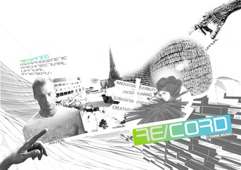 Interior Design student Natalie Fordham, has created an online blog cataloguing her progress on the Design Ethics module of her course. The blog explores the use of materials, notably the cardboard tubes of Shigeru Ban and the vaulted plywood segments of IwoMotoScott's 'Voussior Cloud' (pictured). What this blog creates is a foundation for her to systematically explore and share ideas and inspiration that range from human to organic form. This format of blog writing in a way of showing the creative process of a design project, should be done more often by students. It is a great way to self-promote and shows a great understanding for design and the project. Check out her blog now at http://nataliefordham.blogspot.com/ 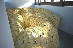 IwoMotoScott's 'Voussior Cloud' 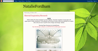  Fantastic website created for all you collectors out there. Obsessionistas finds collections however innovative or mundane and catalogues them in a way that is visually interesting. Quoting the blurb on their website (www.obsessionistas.co.uk) they... "love to feature the unusual, the playful and the irreverent but recognise that even the most commonplace and mundane of objects can be of interest to the obsessionista when relentlessly collected and /or beautifully documented. Our interest lies not only in the nature of the objects themselves but also in the act of collecting and the passion and individuality of the collector." This website is quirky, simply yet beautifully designed and already has some very interesting entries. My particular favourite is the collection of chocolate wrappers (pictured below) which conjured up memories of my childhood, and others that I've never seen before. If you have any strange or even mundane collections please email the details to [email protected]... Happy collecting!  BCU's new TV add has been recently released. Watch it here. A degree from Birmingham City University is a passport to a successful future. From the £180million investment in our facilities to our great links with leading employers, we provide our students with the skills they need to succeed. For more information check out http://bcu.ac.uk/upgrade Every month PPDBlog will be designing a new Desktop Wallpaper for you to download free. If you want to get your graphic work featured in a forthcoming wallpaper please e-mail us at [email protected]
 When asked as part of a post-graduate degree project to create a future of poetic literature, I decided that it was time to create our own stories/poetry influenced by famous pieces. For example this video is inspired by the First World War poem In Flanders Fields by John McRae. I as the reader have created an emotional response to this poem and created a symbolic form to accompany it. I believe that the future of online libraries is more interaction and creativity with the people who interact. Stories that inspire other stories. Watch the Video in High-Definition below. |

Designer. Did a blog. Starting blog again. Early Thirties. Like Food. Like Drink. Like Music. Like travelling. If you like this blog get involved, comment and send me a story or a product, lifestyle, or way of life to promote.
  |
||||
