In our final green themed post for this month we have a look at Dalziel and Pow's Kids clothing store for Paris in Santiago, Chile. Dalziel and Pow are renowned for their revamping and ultimate 'pimping' Interior skills. They notoriously tried to refresh the HMV brand in certain stores to a good effect no matter how doomed HMV were/are. 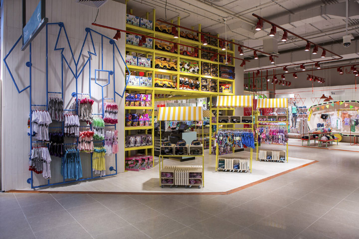
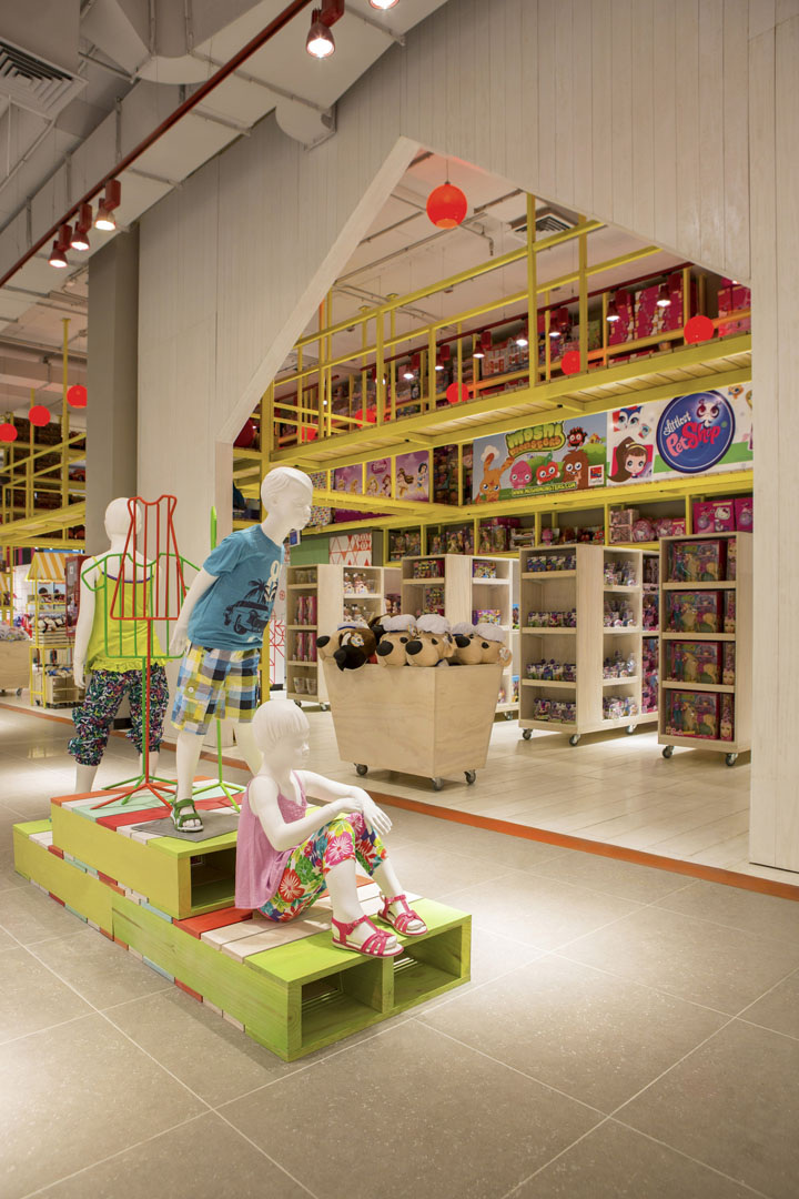
The area is divided into age and gender which is clearly denoted by a change in colour and pattern. There is an overriding feeling of childlike fun within this space. The display systems are intriguing and have many nooks and crannies like a child's play den. 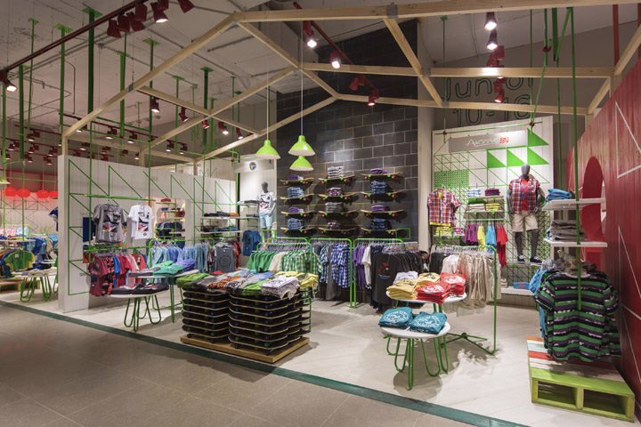
This mix of child like fun translates into the fixtures and fittings. The suspended track lighting isn't in your standard off the shelf colours, they are powder coated to match the colours of that particular area. Vinyl patterns on the wall extend from 2D forms to 3D display units that represent oversized t-shirts and other items of clothing. 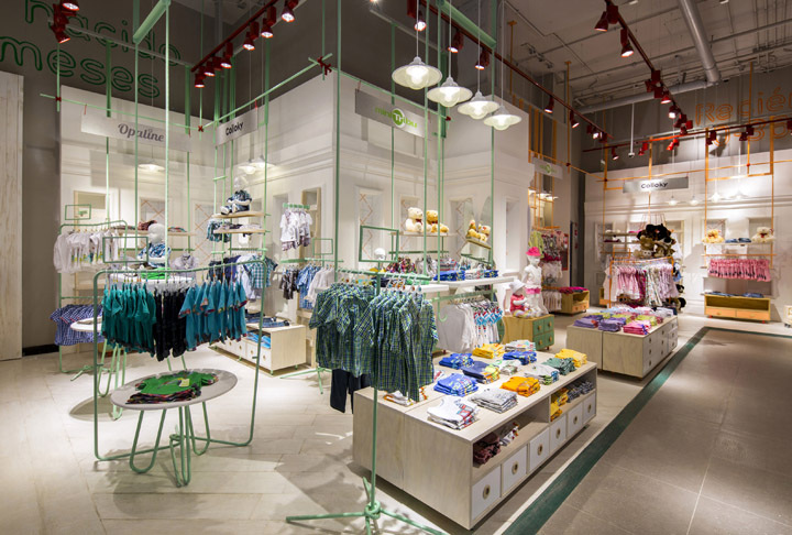
The stand alone display features vary from tables that have clothes on with legs that extend up and over the table to provide space for hanging garments. Keeping in line with the theme of the space the metal tubes are powder coated to match the colour of the theme. 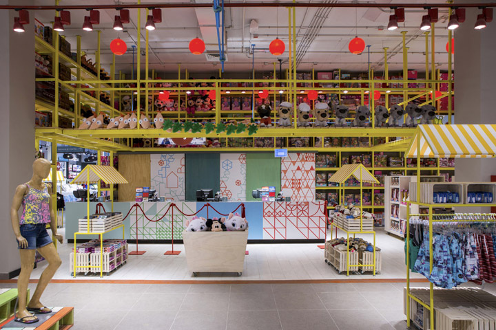
Psychologically this is a clever tactic deployed by Dalziel & Pow because by making the space look like Charlie's Chocolate Factory has extended business to a clothing store, it means children will be excited, amazed and attracted to the items on offer. I find it hard to think of anyone on the UK high-street who has really adopted this style as effectively?
0 Comments
Following up from his hugely successful album Queen of Denmark, former Czars member John Grant has released the first single off his new album entitled Pale Green Ghosts. It is an eerie 6minute track with low pulsating electro sounds and the melancholic Rufus Wainwright like qualities to his vocals, makes for an interesting track and video. The video leaves a lot of questions unanswered and you are left wanting to know exactly what was in the boot of the car. 
Have a listen for yourself and see what you think, Queen of Denmark is an excellent album and well worth a purchase!
Pale Green Ghosts the Album is available to buy on the 11th March 2013. You can purchase the same titled single from Bella Union from the 5th of February or pre-order by clicking here 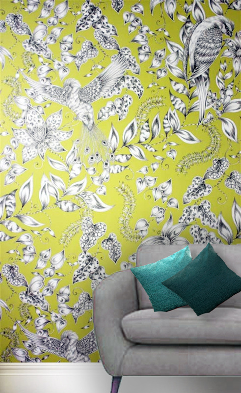 Wallpaper has had a turbulent history and as quick as it re-emerges itself back into fashion it is then abruptly banished into Room 101. However there is a real desire for intricate wallpapers that are bespoke and add that extra bit of elegance that your average hardware store can't supply. The montage I have created above shows the Kayyam range by Emma Shipley for Osborne & Little. This range is an exotic blend of rare birds and flowers. These floral details, in a monochrome effect, provide the perfect contrast for the bright chromatic background. (see below) The wallpapers are made from pure cotton and will add a splash of colour and a bold statement to any feature wall. You can purchase matching upholstery for cushions and each of these colour ways will blend in well with a contemporary or classic sofa with a grey hessian finish. The one shown in the montage above is the Walton range from Next Homeware.
2013 will see statement wallpapers like this very much being the in trend thing. Be creative with your choices and ultimately don't be afraid of colour! For more info: http://www.osborneandlittle.com/ http://www.emmajshipley.com 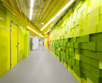
This office Design by Za Bor Architects is for Russia's largest search engine provide Yandex. This specific Design is based in St Petersburg and the bright Interior Features resemble pixelated elements relating to web coding and general geeky computer jargon. 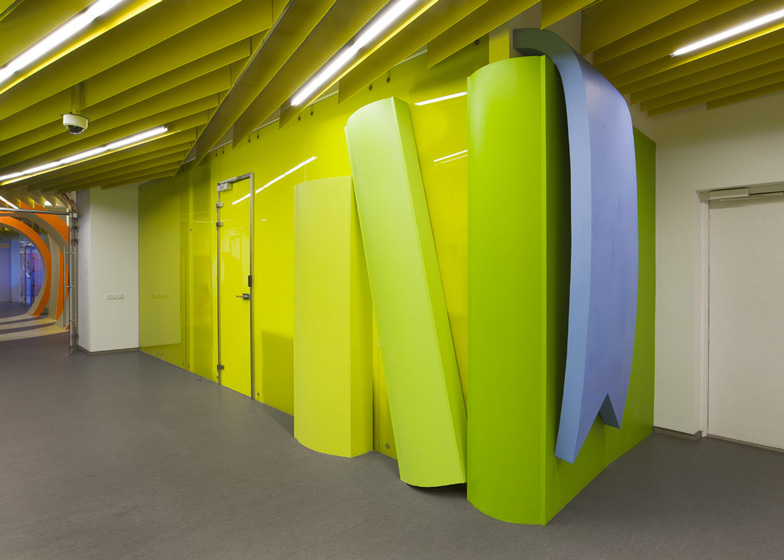
The office spans down a 200 metre long corridor (Dezeen.2013) and has an array of different colours along the way which abstractly gives the illusion you are travelling through their search engine. I admire how a lot of these bright and bold colours all blend well with each other and compliment the grey vinyl floor. The addition of glossy wall surfaces bounce light back into the corridor and create the spectacle of being in a much wider space. 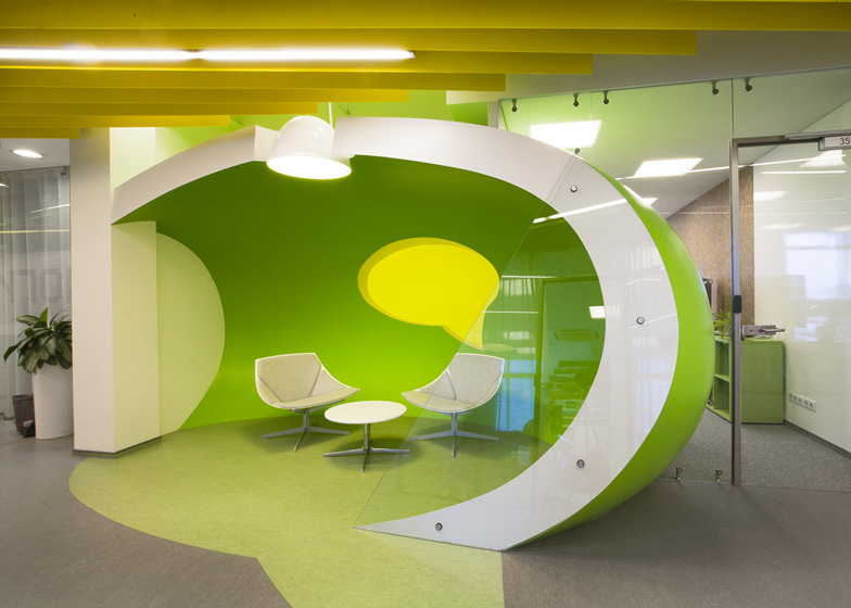
There is a clever use of way finding incorporated into this Interior. The long complimentary coloured fins extend and elongate towards the direction the corridor follows. Not only does this have a functional purpose but aesthetically adds more character to the space and hides away visibly displeasing vents and ducts, whilst allowing strip lights to be suspended in the voids. 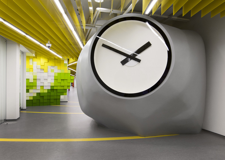
Along this corridor of elusive surrealism you will be greeted by a large blobby clock that disguises the printing room it stores within. There are also little nooks and breakout zones where informal meetings can be had. The back-lit graphical symbol of a speech bubble within this space also encourages the co-workers or business types to chat.
As Green is the theme for this month's posts I have only included images of the Green areas. If you would like more information on this Design then please visit: http://www.dezeen.com/2012/09/03/yandex-saint-petersburg-office-ii-by-za-bor-architects/ 
Juno 5936 Designed by Eva Larsson
Svensson Markspelle are a well established textile company based in Sweden (the name gives it away really) and have been around since 1887. Scandinavian Design is known for its elegance, simplicity and attention to detail. Out of their various ranges, Juno (pictured above and below) is one of my favorites because of the complimentary tonal variations. In both Commercial and Domestic Interiors choosing a dominant colour for your walls is sometimes a bold move and too much colour can drown out a space. To get that fresh Scandinavian look keep the walls neutral and bring colours into the space through the upholstery. The 5936 variation pictured above goes great with warm timber finishes. 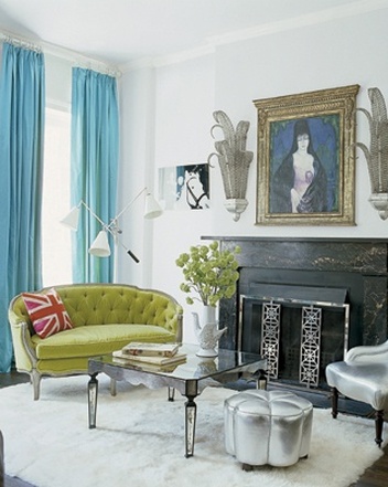
Keep the walls white and let the upholstery do the talking- As demonstrated in Nanette Lepore's Victorian Townhouse.
Their fabrics are suitable for Commercial use with a rub count of 50,000. The fabric is also a pretty mean fire-fighter. Made from Trevira CS, a clever material that has manipulated polyester fibres along with other sciency genius, which provides long term protection against fires.
For more information please visit: http://www.svenssonmarkspelle.com 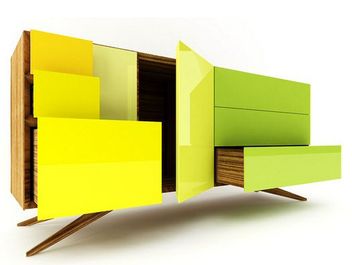 The Incunabular sideboard by Simon Moorhouse just looks fantastic. With its variety of differing wood finishes ranging from European Oak or a Solid American Black Walnut finish and customisable glossy coloured front it sure is a thing of beauty. 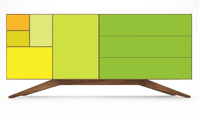 The arrangement of the sliding and hinged drawers have a certain deja vu about them. They are in fact inspired by the ratios of the iso 26 paper standard. 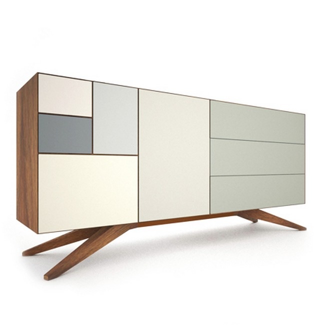 Its sophisticated simplicity is beautiful. I especially admire the stretched apart legs. It's like the sideboard is doing the splits, testing its strength and ability to defy the rules of physics. It's admirable, stylish and has a range of tonal colour schemes that compliment any modern household.
http://www.invisiblecity.co.uk/products/sideboard/ It's hats off to Haim for winning the BBC Sound of 2013, but flicking through the shortlist at a sporadic pace, I came across a Dublin 5 piece which fit in perfectly with this month's green theme. 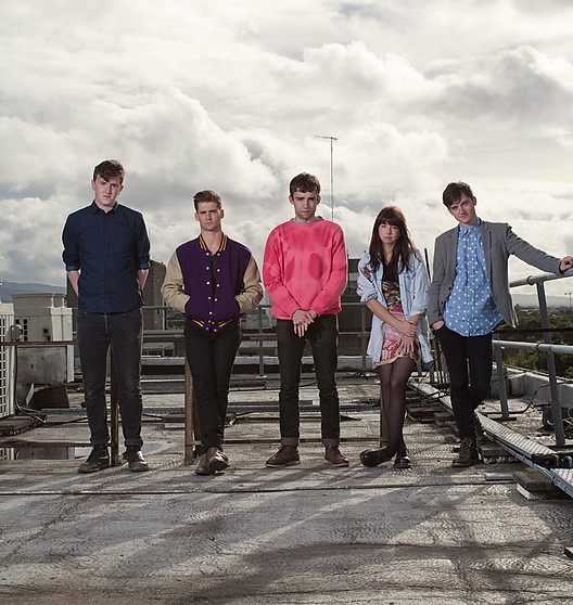
There is a pulsating undertone thud of the drums with whimsical and atmospheric vocals which makes their single, The John Wayne, a pleasant treat for the ears. Very much reminiscent of the euphoric sounds of Band of Horses or Fleet Foxes. Their debut album 'absolute zero' is out later this year and promises a fruitful treasure trove of hits.
It's great to see some fresh talent, albeit the Dublin 5 formed over 5 years ago, getting media attention. Fingers crossed for these guys that they'll do well. Enjoy. There are many places in this world I wan't to go. Some for their culture, some for their landmarks and some for just the luxury of the warm sun basking down on my English shade of face. However I never imagined myself wanting to visit a place for its 'fruit and vegetables'. 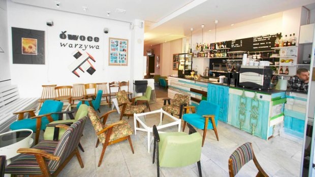
Owoce i Warzywa is Polish for Fruits and Vegetables and is a bar located in the centre of Lodz (see the Google Map view at the bottom of this post). As the image above shows this place is a Pandora's Box of quirkiness and a haven for creative types. The Plywood bar is a mash up of different cuts of wood samples all painted in different shades of green within the blue spectrum. 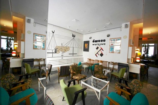
This bohemian eclectic mix of various materials extends to the upholstery which is similar in shade variety to the bar. What makes this bar A. Successful and B. Interesting is the application of graphics to that masterfully scatter the walls. This graphical image comes across in a digital being through their fantastic website that is formed of quirky graphics and coloured blocks. 

What most bars and restaurants do is hire a Graphic Designer along the lines of 'can you do me a website?' and that's that. What makes the real difference is being able to translate that brand into every item possible. This is a bespoke experience and therefore it gives the impression that the owners care about their image and care about the importance of Design and fundamentally how something they run looks. Their menus, coffee cups and even down to their loyalty cards are all identifiable as being part of this restaurant. 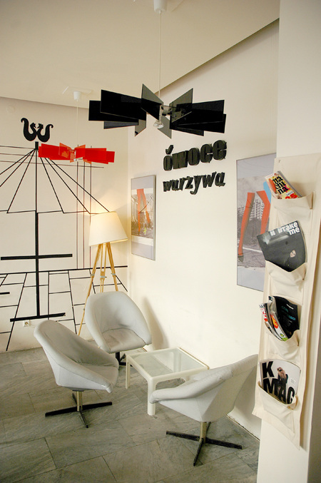
A great place with a great atmosphere not only needs great people but great Design. A Design doesn't just start with a building and end with an Interior. It is the finer detail as well that completes the whole experience and feel for a well designed space. Their niche doesn't just filter out to serving fine alcoholic beverages and superb local cuisine, they give the space an alternative use with hosting art house films and playing music as bonkers as the space itself. If you're in the area or planning on visiting then have a gander at the map above. It is easily accessible by the Lodz tram system. If you fancy a look at their frankly amazing website then have a click click below. I'm off to have a look at some more superlatives now other than 'great'.
http://www.owoceiwarzywa.com/ 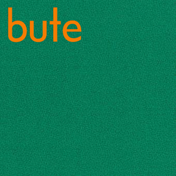
If you're looking for some great upholstery in Emerald Green than look no further than Bute fabrics. Their Pentland 8080 Swatch was the closest match I could find to the Pantone Colour of the Year.
These are high quality fabrics coming from the infamous Isle of Bute off the west coast of Scotland. The Pentland range is 85% wool and 15% nylon making it suitable for heavy duty commercial and domestic Interior use. Personally this would look great as an accent colour for seatpads at a Gastro Pub/ Bistro, or for soft seating in a coffee house. For more info on this fabric please visit: http://www.butefabrics.com/fabrics/CF706-8080/Pentland 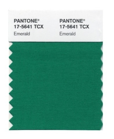
Well it's a New Year and that means just one thing, no not more increases in rail fares, but the more pressing issue of what colour Pantone have announced as the colour for 2013. As you have probably guessed it has gone to the colour 17-5641 TCX. In human terms this means Emerald Green.
So in celebration of this, the website background has put on a new Emerald coloured coat, and for all of January here at PPD we will be looking at all things Emerald Green. I think this colour is pretty classy and will complement other tones of green and light grays very well. One thing for sure is that this tone will be popping up in fashion and interiors for the duration of 2013. |

Designer. Did a blog. Starting blog again. Early Thirties. Like Food. Like Drink. Like Music. Like travelling. If you like this blog get involved, comment and send me a story or a product, lifestyle, or way of life to promote.
  |
